I read
Project Rooftop's announcement for their Iron Man: Invincible Upgrade contest with great interest as, like the
Beasts! volume 2 open call, it seemed like a good springboard for some focused drawing, and the opportunity to create some decent blog post fodder.
That wasn't my first thought when I heard of the contest, however. My first thought was, "Holy crap, redesign Iron Man? How on earth would you do
that?"
See, Iron Man's "costume" is, essentially, his powers and, in large part, his whole character. And while it's changed a lot over the years, it's only changed
drastically a couple of times (mainly when it went from the original big, boxy "garbage can" design to the the slimmer, more man-shaped one he still wears a form of), and most of the changes seem to be rather small ones.
So I went to bed that night, thinking of Iron Man and his armor and, over the course of the next few days, I sketched out some ideas, two of which I ultimately submitted to Project Rooftop (You can see the actual winners
here, and I discussed some of my favorites
last night).
Here’s the first thing that came to mind:

Ha ha, get it?
Iron Man? Ha ha. Instead of repulsor rays, the holes in his palms shoot out steam, the same force that comes out of his boot jets and propels him through the air.
This struck me as mildly amusing when it first occurred to me, but by the time I was done drawing it, the joke wasn’t the least bit funny. Besides, I’m sure someone has used it somewhere before. If not a professional in print somewhere, than at least a grade school kid drawing it in a notebook to amuse his friends, then.
So, I didn’t bother submitting this one at all.
The next idea was in the same unserious vein.
Given the fact that Tony Stark is no longer keeping the fact that he’s also superhero Iron Man a secret from the world at large, there’s really no need for his Iron Man costume to function as a disguise in addition to a wear-able super-weapon.
So, I came up with this:

The American flag on is iron lapel? That’s actually a magnet.
I didn’t submit this one either, although now I’m thinking it’s probably the strongest of the four I put on paper. Not one I could ever actually see Marvel using in one of their comics, though.
So, with the joke ones out of my system, I tried thinking a little more seriously about an Iron Man redesign that could conceivably be used in a real comic book.
I started thinking along the lines of computer, automobile and robot designs, the way they trend, and ones I’ve seen in the past that I like.
The major problem with an Iron Man redesign, as far as I saw it, is that technology tends to get smaller, slimmer and sleeker the longer it’s around, but unlike computers, cell phones and music-listening-to devices, the Iron Man armor can only get so small, slim and sleek. At the very least, it always has to be roughly man-sized.
So the only way to make the armor sleeker would be to make it thinner, and that was the idea with this next design.
Here’s the original sketch,

and here’s a final one,

which I did submit.
This is meant to be an Iron Man costume that's more like a coat of paint or a candy-coating than a suit of armor. It would likely be some kinda liquid metal, one that would run over Stark like mercury when he was putting it on or taking it off, and he'd ultimately have the appearance of a red and gold version of the Silver Surfer or DC’s Captain Atom.
Since he no longer has a secret identity to protect, he doesn't need the featureless face-plate, but could wear something like this that hugged his features completely. (One of the robots I was thinking of was the Tom Peyer/Rags Morales
Hourman, as he was a human-looking android with coloration similar to Iron Man’s).
My drawing isn’t terribly detailed because, well, I’m not much of an artist, and can’t do detail work very convincingly, but I imagine with this armor, Iron Man would basically look like a naked, painted Tony Stark, with a more Ken doll-like crotch (on account of a modesty concealing cup, perhaps).
I drew him without a goatee or moustache, because I think liquid metal facial hair looks kinda stupid (I think the
Armageddon 2001 future Captain Atom had a beard under his metallic sheathe and it looked alright, but, well, I’m no Dan Jurgens). With a good artist, though, it could work. Or maybe he could just shave before Iron Man/Avengers missions, and let his 'stache grow out when he’s being Stark for a few days.
The blue bits on this costume would light up. The eyes would have various vision-related powers, the soles of his feet would allow him to fly, and he’d have repulsor rays in the palms of his hands, and the circle in the chest could work as a spotlight, and maybe shoot out energy like a cannon when needed.
This would limit his capabilities a bit, since he couldn’t carry much on him. For example, grappling hooks and rocket skates and missiles or machine guns or whatever are out; there just isn’t room in the armor for them. That would reduce the sort of Swiss Army knife nature of the armor.
I prefer the sketch over the final one. I like the paler colors, and the more heroic pose. The latter version looks too bright. He’s supposed to be coming in for a landing there, but, eh… I didn’t feel like redrawing it. (I note Project Rooftop's Joel Priddy had a similar idea in terms of some kind of liquid-y armor; Priddy's fellow judge Dean Trippe calls it "nanoliquid.")
Okay, so, short of shrinking the armor as much as physically possible, I thought the
other way to show a newer version of it would be to make it more of an art-object. That is, rather than simplifying it, making it more ornate and complex, in a way that is showoff-y (Here I was thinking of another robot I liked a lot,
Masters of the Universe toy Roboto, which had a clear chest cavity with little gears that would move when you moved his arms or visor).
 (Above: Roboto)
I pictured a big, clear, glass-like Iron Man armor. The only opaque parts would be the face-plate, and perhaps the gloves and boots. Stark’s body would be sheathed in some kind of tight, red bodysuit, and, the human-sized figure inside the clear armor would look a little like a red skeleton. Between the visible Stark outline inside and the outer, clear-metal shell, you’d see all kinds of ornate, baroque clockwork gears, and perhaps brass-colored tubing acing as “veins” in this armor. Various elements would light up, so that when he, say, readied a repulsor ray, you would see a spark form in one part of the armor, travel down a brass-colored tube, build up in the forearm, and then blast out of the palm. Likewise, every time an arm or leg would move, you’d see the gears turning.
I didn’t even attempt to draw that because, Jesus, just imagining it was complicated. I couldn’t begin to actually put it on paper.
Finally, I thought of sort of breaking the rules that have bound all of Iron Man’s armors over the years together, and seeing what that looked like. Specifically, I wanted to move him away from the robot-looking, guy-in-battle-armor look and toward a more standard, iconic superhero. In other words, less Iron Man and more Superman.
Here’s what I came up with:

Complete with notes from Stark himself.
For the head, I looked at the G1 Transformers with more human faces (Starscream, Megatron, Ratchet, Prowl, etc) and Voltron. I wanted to not only give him a radical new look, but also one that would get away from the two-slits-for-eyes, one-slit-for-a-mouth look that’s been the standard for pretty much all of his costumes.
And a nose. Iron Man’s nose armor was a disaster, and, if you were to think of a single rule of Iron Man armor, it would be
never include a nose (Note that PR third-prize winner Jemma Salume did, and it looks pretty cool. Of the 14 currently posted on PR, it’s one of only two that dared a nose). A squarish, more Transformer-y nose, however, would be better than that Mr. Potatohead-looking one in his official nose armor. A more naturalistic, Voltron-like nose sculpted right onto the face of the armor, rather than jutting out in a square like this one, would work okay too, I think.
On the chest, I gave him a Superman-like logo. At first I was going with an S-shield shaped pentagon, but switched to a triangle, since the S-shield was
too Superman, and Iron Man’s had triangles in his armor before. And, of course, “Fe” for Iron, which I swiped from one of the Metal Men designs. Speaking of swiping from DC heroes, it would have big, show-y bolts on it like one of the iterations of John Henry Irons’ Steel armor (a character who has quite a bit of Iron Man inspiration in him) and the same sort of bolts are used to keep his cape on.
The cape, like the chest symbol, gives him a Superman like appearance, and I just think the Marvel Universe could use more capes. Especially now that Iron Man has proven himself the MU alpha-male through the events of
Civil War, he oughta look more regal and iconic, and nothing says regal and iconic superhero like a cape.
I gave him big, huge forearms and fists to go for a Popeye-esque look, as Popeye’s design is so perfect. You just look at Popeye’s figure and you see “punching machine.” That’s what Iron Man should be, in a sense, isn’t it? A punching machine?
(In describing their take on
Iron Fist, I’ve seen it said that Brubaker and Fraction have reduced to single phrase “kung fu billionaire.”
The old '60s theme song for the Iron Man cartoon tells us that Tony Stark is a "cool exec with a heart of steel," a phrase blogger
Chris Sims said gives you pretty much all you need to know about the character. Me, I’m thinking “punching machine” is Iron Man's version of "kung fu billionaire.")
What else? I drew the feet huge to echo the fists, but also I wanted to draw “lifts,” as I was thinking of Stark designing his armor and the way middle-aged men choose big cars to…compensate for some things. So I thought he’d want armor that made him look bigger. I think the crotch would have a sculpted bulge to it too, for the same reason.
I would have kept yellow out of it all together, but I think the rules said something about redesigning the red and gold armor, so I made the cape yellow. I like the idea of bringing an iron color back. One of my favorite “real” Iron Man armors is the one that’s red and gray, as opposed to the more traditional red and gold.
I looked to one of my favorite Bearbricks, which is a robot design, for the color scheme:
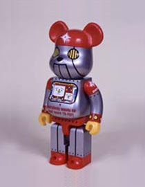
Basically, this Iron Man costume is a marketable, action figure of a hero; a big huge toy.
So, those are my Iron Man redesigns, submitted and not, and my thought process behind them.


 (Above: Roboto)