I wasn't sure if I would be able to read this one or not, seeing as how it features art by Greg Land, the anti-artist whose static, phony-looking panels do exactly everything wrong that one could possibly do wrong while trying to tell a story in the comics medium. An artist couldn't provide worse comic book art if they were actively trying too. Probably because if they were trying to create bad art, they would just render everything poorly, but Land's problems are much, much deeper--it's his staging, his character designs, his inability to "act" through his characters, its the way panels don't flow from one to the next, the way there's no visual continuity. That's on top of the poor rendering, and the lifeless, antiseptic world he creates by manipulating photoreference into finished product.
I want to say his work is unreadable, but I did make it all the way through an entire page collection of it (even if it did take me three tries to do it), so that's obviously not true. I suppose that's what come from reading as many bad superhero comic books over the years as I have: There's nothing that Marvel can throw at me that I can't make it through now.
This book collects five issues of the previous, since canceled-and-relaunched volume of Uncanny X-Men (#540-#544, if you care), four of which tie into Fear Itself. These comics are written by Kieron Gillen, who hear seems to know his stuff and at least be trying to tell a fun, action-packed story in the midst of what must be one of the angstiest (if not the angstiest period in X-Men history). I'm not sure I bought many of the supporting elements of the story, which seem to have been put in place because they had to be in order to get various pieces in place for the X-line's next few months of stories, and this story behaves a bit differently than the other Fear Itself stories I read (including, most importantly, Fear Itself itself), but Gillen does a pretty fair job on the script.
He is, of course, undercut constantly and at every turn by Land. I could scan just about any panel from any page to post and point at, but let's look at a few of the earlier and more egregious examples.
Here are four consecutive panels from the first issue, in which Piotr "Colossus" Rasputin and Kitty "Kitty Pryde" Pryde argue about the way the X-Men are treating his little sister Magic, who did something really bad in a previous story, and so is now being kept in an underwater prison:That's not important, for these purposes. What is. No, check out the Kittys in the first and fourth of those panels; not only has her hairstyle changed pretty dramatically—in length, volume and whether or not there's any curl to it—but her fucking face has changed too.
Two scenes later is one of the weirder scenes in the book. Namor has flown away from where we last saw him (Fear Itself: The Deep), changed from his current costume into his old Speedo costume, and then flown to see Emma Frost and tell her he'd like to fuck her one more time before he goes off to likely die in battle (I guess they did it in the recent past...? That guy has a thing for gorgeous blonds attached to tall, skinny, humorless super-team leaders, I guess).
Check out how his body morphs between these two consecutive panels: So, Greg Land: Still the worst.
As one of The Serpent's Worthy, the guys who got evil magic Thor hammers that made them more powerful and also evil thralls, is X-Men villain Juggernaut, that's the part of Fear Itself that Gillen ties his story into.
The Juggernaut flies through the air to crash like a meteor near a gas station which has only one ad on its window, and it's for Orbit (Orbit sponsored this story arc, I guess; there are multliple Orbit logos in the art. Weird Marvel can't sell normal ads anymore, but they can find customers for their bizarre product placement ads: "No, we won't buy a half-page ad, but how much would you charge us to have someone cut-and-paste an image of our logo onto a billboard that the Juggernaut can throw an X-Person against...?")
There he touches his hammer to the face of a bystander, which tattoos the Fear Itself logo onto that guys face, and then transforms him into a sort of hype-man for the Juggernaut. Then Juggernaut proceeds to walk very slowly towards San Francisco, every one of his footsteps leaving a glowing pink Nordic-looking rune on the ground like a footprint, something that the other Worthy don't do in the other comics, but will prove important (or, at least "important" at the climax).
Meanwhile, the X-Men are pretty much just chilling around San Francisco, wondering how weird it is that the rest of the world is going to hell while everything seems pretty chill in San Fran. Being shitty, selfish superheroes, they decide to just hang around and wait to see if their neighborhood gets attacked by an apocalyptic threat, rather than, I don't know, lending a hand anywhere else (Not all the X-Men suck, of course; Wolverine and all his teams were already engaged in combating The Serpent, Namor and Psylocke popped up in other tie-ins I read this week).
After Scott "Cyclops" Summers trades some quips with Sadie Sinclair, the apparently 22-year-old mayor of San Francisco (in the Marvel Universe, anyway), it becomes apparent that the Juggernaut is headed their way, and they will need a joint response to deal with them.
The bulk of this collection consists of Cyclops throwing various mutants and combinations of mutant teams at the unstoppable foe—made more unstoppable by his magical upgrade. It reads an awful lot like Gillen looking at the list of 200 or so X-people he must have somewhere, thinking about their powers, how they might be creatively employed, and how a magic Juggernaut would remain un-stopped by those powers.
Eventually, the consult the one mutant who knows a lot about magic, identifiable by the fact that she is, of course, named Magic, and she, Kitty and Colossus go to hell to convince the demon that originally empowered Juggernaut that Juggernaut has betrayed him by serving the Serpent instead, so that demon takes away Juggernaut's power and is going to gift/curse it to Magic, when Colossus nobly steps in and decides to bear the burden of the curse instead.
For some reason, he then gets his own Juggernaut hat (I thought Juggernaut just wore that hat so Charles Xavier couldn't screw with his mind...?), and returns to earth to have a Juggernaut-off with the old Juggernaut. Spoiler: Colossus wins.
A couple of franchise-specific ramifications emerge from this story, which obviously has very little to do with Fear Itself (though the good guys win here, just as Dracula's forces defeated the Hammer-ed up Hulk at the end of Hulk Vs. Dracula, apparently it's only a very temporary win, as The Worthy are all in the climax of Fear Itself).
Firstly, Colossus is now Juggernaut II or whatever, which causes Kitty Pryde to dump him in a hilariously melodramatic scene where she angrily tells him, "You'd have sacrificed yourself rather than risking anyone else...It's great that you're willing to die for me, Pete. But I need someone who's willing to at least consider living."
See, she's pissed at her boyfriend for nobly risking his soul and his life to save his little sister from a fate worse than death and, in the process, saving the X-Men (and mutantkind, given their limited numbers) as well as the entire greater San Francisco metropolitan area. His girlfriend would have preferred he acted selfishly, and thought of himself and his own personal safety first.
So I guess Kitty probably shouldn't be dating in the superhero community, if she's so against heroic behavior. And I guess that means she's still being written as the readers' ideal imaginary girlfriend....?
And then Cyclops has a telepathic student of his hijack the mayor's body and temporarily paralyze her while he threatens to murder her and make it look like an accident for about two pages. Which must Example of Cyclops Being An Evil #19 that I've read, and I'm an awfully casual reader of X-Men comics.
The final issue has nothing to do with Fear Itself, and was fairly weird. There's a strange opening page where Jack Kirby art is appropriated and new dialogue added for a refreshingly bizarre page (although I'm not sure how I feel about Kirby's art being used posthumously like that and, the more I think about it, the more uncomfortable it will likely make me). And then there are scenes of a new look Mr. Sinister writing X-Men comics with a flying, voice-command ink pen and doing something that involves dying and being reborn in the same body or...something. He has a very poor beard; if he's not going to connect his muttonchops to his goatee, he might as well just shave. To beard or not to beard is the question, Mister; you can't leave such a tiny space un-bearded!
The Sinister scenes are intercut with scenes on Utopia, in which original X-Men Iceman and The Beast tell Scott to fuck-off in their own ways. Iceman is drawn wearing boots in his iced-up form, which makes him look even more naked than when he's not wearing any clothes.Land draws Beast like Mr. Tawky Tawny, resembling a dude in a suite form the neck down, but with a big cat head. This is probably because to draw a huge cat-man in a suit would require Land to abandon his reliance on photoreference; he solves the problem by just giving Beast a normal human body, and avoiding drawing him as much as possible.
Check it out:Extreme long shot, extreme close-up on his eyes, and one medium shot in which you see his face and shoulders. Whew!
And that's Fear Itself: Uncanny X-Men—a better-than-average script coupled with the worst art imaginable, resulting in an extremely unpleasant reading experience.
I'll leave you with an image of Colossus, Kitty and Magic having furious hate-sex with a giant devil hand:
Showing posts with label the x-men. Show all posts
Saturday, January 12, 2013
Sunday, September 09, 2012
Review: X-Club
The X-Men franchise may be unique in super-comics in that there are just so goddam many X-Men characters—about 200, the last time Marvel took a head count, right?—that series and stories need not be structured around particular teams or settings, status quos or mission statements, but can rather just pick up a handful of characters almost at random and hang a story on them.
The 2012 miniseries X-Club, the trade collection of which rather remarkably doesn’t include the prefix X-Men: in the title, is just such a story. It’s written by underrated super-writer Simon Spurrier and drawn with sharp, expressive art by Paul Davidson, and features a few members of the X-Men’s so-called “Science Team,” an invention of Uncanny X-Men writer Matt Fraction’s.
These are various scientist characters originally gathered by Dr. Hank “The Beast” McCoy to try and undo former Marvel Editior-in-Chief Joe Quesada’s “M-Day” directive; in-story, they were put together to try and figure out a way to re-populate the world with mutants after the reality-warping powers of one mutant somehow de-mutated most mutants (Look, I don’t get the science of the thing; I don’t think anyone does, really).
Anyway, these are Dr. Nemesis, a Golden Age Marvel character recently repurposed as an arrogant, snarky super-genius who talks a bit like an all-ages Spider Jerusalem; Dr. Kavita Rao, the doctor who created a mutant “cure” in the pages of Joss Whedon’s Astonishing X-Men; Danger, the sentient Danger Room that menaced the X-Men during Whedon’s just-mentioned run; and Madison Jeffries, and Madison Jeffries, an old Alpha Flight character with the ability to reshape inorganic matter and to communicate “technopathically” with computers and robots and stuff.
The miniseries isn’t focused on that goal, but on the quartet of X-Men affiliated super-scientists gifting the world with a technological marvel as a sort of goodwill, see-we-do-more-than-just-collateral-damage-so-quite-fearing-and-hating-us-gesture: The Stringstar, “This proud planet’s first viable space elevator,” which reaches from a space station in orbit down to a rig in the sea (and, come to think of it, looks a bit like a large version of that tube that the Satellite of Love guys used to use to send things back and forth to Deep 13 with during that one season of Mystery Science Theater 3000).
Things naturally go a bit haywire, when an Atlantean protestor starts mutating and explodes, and local sea-life develop mutant abilities, as illustrated in this awesome panel:
And then Danger starts acting villainous again, Jeffries gets in a lot of trouble, some sort of psychic octopus attaches itself to Nemesis’ head, revealing his actual thoughts out loud constantly, often deflating his posturing dialogue
And Spurrier does this weird bit where he keeps checking in for a page or two per issue with various events in Marvel android history, eventually revealing a connection to the conflict of the series which is…well, it’s pretty complicated, and I don’t want to spoil it, nor spend the time it would take to reduce it into something easily communicable in a few sentences.
Suffice it to say the plot is big and crazy in a way that would (or at least should) satisfy fans of Fraction’s particular style of big and crazy, and it’s communicated with a great deal of character-driven humor emanating from the various personalities and their conflicts, and the set-ups like that psychic squid thingee.
While the four X-Clubbers (that’s not what they call them is it? I’m just guessing) are the stars, the rest of the X-Men play supporting roles and offer cameos, and are quite effectively used.
This is apparently taking place after the “schism” between Cyclops and Wolverine and their respective factions of X-people (if you weren’t paying attention/caring, Cyclops and his gang are on a mutant isolationist island called Utopia and are intent on the survival of their race at all costs, while Wolverine and his gang have reopened Xavier’s School for Gifted Blah Blah Blah under a different name). Spurrier has Cyclops worried about branding, to the point where he keeps referring to his team as “The real X-Men” and insisting of adding “of Utopia” at the end of each mention of the X-Men.
Somewhat unusually, at least from my experience with this franchise of characters, the book ended up being very fun, very funny, highly imaginative and easily accessible. It’s not often I set down an X-Men comic book and think to myself, “Wow, I’m really glad I read that X-Men comic book,” but this was one such occasion.
Sunday, August 19, 2012
Review: Dark X-Men
I'm not quite sure I understand how exactly this particular comic book mini-series would have worked, or if it worked as it was originally published in 2010, as part of the big, Marvel Universe shared mega-narrative of the time.
This was the post-Secret Invasion, pre-Siege era in which the president of the United States had decided that former supervillain and mentally-ill convicted murderer Norman Osborn should replace Tony "Iron Man" Stark as the Marvel United States of America's official Boss of All The Superheroes, apparently based on the fact that Osborn managed to shoot the queen of an invading alien army in the head before Iron Man could shoot her in the head. That's how presidential appointments work, in Marvel's United States. There, Donald Rumsfeld was made Bush's Secretary of Defense based solely on the fact that he was the first candidate for the job to score a head-shot during a supervillain attack on Bush/Cheney campaign headquarters during the 2000 campaign.
Anyway, the state of the X-Men at this point in Marvel recent history was a little weird–they were magically whittled down to just 200 mutants, and most of them moved onto a little island off the coast of San Francisco that they declared the sovereign nation of Utopia, which is just asking for trouble (I woulda went with "San FranXo").
Osborn, being a villain, hired a bunch of villains to dress up as The Avengers in a book called Dark Avengers, using them as his own personal version of the Marvel Universe's premier super-team. This is Dark X-Men, and the premise is therefore quite similar—Osborn-approved bad mutants masquerading as good mutants—but since the X-Men play such a different role in Marvel society, there doesn't really seem to be any reason for Osborn to need/want a team of his own.
That is, if the Avengers are the police of the Marvel Universe, the X-Men are more like vigilantes. If the Avengers are the armed forces, the X-Men are freedom fighters or a terrorist cell.
So I had a hard time wrapping my head around this book's very existence, and thus really appreciate what a decent job writer Paul Cornell did of making a self-contained, super-people drama out of it, one more focused on a collection of bad, broken people trying to meet their own goals. Also, he kinda sorta makes it all about Osborn, rather than The X-Men (Dark, Uncanny, Astonishing, Legacy-having or otherwise), so that it seems to be a thread of the the whole "Dark Reign" tapestry of post-Secret Invasion, pre-Siege Marvel stories.
His X-Men, seen on the cover as depicted by former Astonishing X-Men artist Simone Bianchi, are Mimic (who actually looks like original X-Man Angel), Dark Beast (who is apparently just like regular Beast, but evil), Mystique (who shape-shifts to resemble Jean Grey when in public) and Omega (who I think is maybe from an "Alpha Flight" story, and was maybe introduced in that one Brian Michael Bendis issue of an Avengers comic which spent some eight pages, mostly splash pages, visually describing a town in Alaska blowing up or something).
Cornell, working with his Captain Britain and MI:13 partner Leonard Kirk (and Jay Leisten, who inked 3/5ths of the book) introduces the characters in each issue with a little box listing their name and a song title to describe them, which is either clever/cute or annoying, depending on if you get the references, and/or care to think about the ways in which Nathan Grey, the shirtless mutant messiah who used to star in a book called X-Man is like a particular Rolling Stones song).
Cornell portrays Mimic and Omega as basically decent but screwed-up people trying to do the right thing more often than the wrong thing, but aren't quite in control of their enormous powers and lacking something upstairs or in their hearts. The Dark Beast is an unrepentant psychopath, although there's a kinda clever gimmick to the way Cornell rights him, as post-human sentient who regards human beings the way too many human beings regard animals (the blatancy of his name and appearance form nice, bombastic underlines and exclamation points).
In the course of their duties as Osborn's own personal mutant-focused super-team, they stumble upon Grey, whose backstory I don't know/get at all, but apparently he's some kind of pure energy, nigh-omnipotent future mutant with the potential to do a lot of good for the world, including the bad-to-worse members of the "Dark X-Men," and he attempts to do it by hijacking Norman Osborn's brain, which leads to a weird little adventure inside Osborn's mind involving the title characters, Grey, Osborn and The Green Goblin.
It's a down ending of course, because it's part of a mega-narrative with the word "Dark" right there in the branding, and because the happy ending has to be saved for the Brian Michael Bendis conceived and executed Siege storyline that undoes this status quo, but it's a decent character study of Osborn and, to a lesser extent, the minor characters given a spotlight in the title.
The real stars though are Cornell, whose writing is sharp, clever and imaginative, and Kirk, whose art is smooth, clear and clean, building settings and characters that feel organically linked and occasionally calling to mind the superhero art of Stuart Immonen.
I don't really like X-Men comics, and I don't really know much of anything about any of the characters running around the pages of this book, but I kinda liked this anyway, which I assume is thanks to the great care and craft that went into making it, and Cornell and Kirk's ability to take apathy-inducing source material and make something interesting out of it.
Tuesday, December 13, 2011
Review: X-Force Vol. 1
I assumed I was making a joke, and exaggerating a bit, as at least one member of the team didn’t always have blades in her hands or growing out of her hands.
That character was Rahne “Wolfsbane” Sinclair, who was introduced in the ‘80s as a member of The New Mutants and has the neat mutant power of being a werewolf, which seems admirably like creators cheating (Like, someone thought, “I want to write about/draw a werewolf, but I’m stuck on this stupid X-Men spin-off, so I can only write/draw mutants…Oh wait!” I don’t know. Having a mutant whose mutation is being a werewolf seems somewhat akin to having a mutant hero whose mutant power is to turn into The Hulk or be basically Deathstroke, The Terminator from the New Teen Titans or something).
I assumed she was on the team, since she appeared on a majority of the covers I saw. But then I read the massive hardcover collection of X-Force Marvel published in June of last year and, it turns out, Rahne was simply one of the many X-Men characters who turned up in the book, who seemed to be in the extended cast, but wasn’t really an official part of the team, in that she worked with the other characters and went on X-Force missions.
Instead, she spends some time captured by some of the bad guys, gets brainwashed into taking something form another X-Men character and, while present for much of the first volume, isn’t really on the team. Other such characters who drift in and out of the various narrative threads without seemingly having X-Force membership cards include Cyclops, Angel, Domino, a golden-skinned kid with healing powers I’ve never seen before named Elixir, a bad guy with terrible tattoos and teleportation powers I’ve also never seen before named The Vanisher and, most randomly, Ghost Rider, who shows up for an issue or two to help fight a demon.
So who is on the team?
Well there’s Wolverine, whom we all know and love. There’s X-23, who is apparently a teenage girl clone of Wolverine, differentiated from her genetic source material by the fact that she only has two claws on each hand (but a third one on each foot!), has no identifiable personality beyond “killing machine,” has huge breasts and wears a mask-less, belly shirt version of Wolverine’s costume.
And, finally, there’s the Native American mutant whose name is actually—no shit—“Warpath,” the only member of the team who has to carry his own knives, since he doesn’t have any growing out of any of his extremities. He is also different from the other two in that he has apparently never killed before, or hasn’t in any great numbers, which is why Wolverine is opposed to him joining the team at first.
Actually, Wolverine is opposed to X-23 being on the team as well. And Wolfsbane, whom wants to join the team, but doesn’t get to. Either Wolverine knows the toll totally killing all your enemies takes on a person’s soul and wants to spare others from the pain he feels, or he loves killing so much he’ greedy for it, and doesn’t want to split up slaughtering bad guys duties with other characters—he wants to keep all the fatal stabbings for himself.
I would call these the X-Men stabbers, but the bad guys refer to this team as “all of the mutant’s best trackers and killers.”
And who are these bad guys?
Well, there are five individual stories contained in the giant, 300-page hardcover that collects X-Force #1- #11 and X-Force Special: Ain’t No Dog, three of them written by Craig Kyle and Christopher Yost. Of these stories, the biggest is the imaginatively titled “Angels & Demons” (the series was relaunched as Uncanny X-Force before they could get to “Digital Fortress” or “The DaVinci Code”) and it’s pretty complicated.
There’s one of those crypto-Christian religious sects/militias that the X-Men sometimes encounter, the kind with suspiciously vague and simplistic tenets of belief (usually, something along the lines of “mutants bad, God good”). They are called The Purifiers, and they apparently had something to do with the X-Men crossover event that X-Force used as a springboard to publication (The one that introduced Hope, I guess—“Messiah Complex,” I think…?).
This group attaches the head of a preexisting X-Men villain I’ve never heard of onto the body of another preexisting X-Men villain I’ve never heard of, and it’s apparently pretty powerful. It finds some other preexisting threat—like, semi-sentient alien technology, or something—on the ocean floor, and uses that to resurrect all of the X-Men’s old human asshole enemies, all of whom this villain can control as puppets. The human leader of the Purifiers and his immortal-monster-disguised-as-human friend grate against the leadership of this new composite villain. The grand plan, though, is to steal Angel’s wings, robotocize them, and graft them onto the militia guys, so they will basically just be a Christian, anti-mutant militia that can fly.
Also, they’ll look like angels!
Cyclops thinks this will be very bad for his people, so he wants Wolverine and the gang to stab everyone involved to death for him.
That six-issue story arc is followed by a four-issue arc entitled “Old Ghosts,” in which Wolverine, X-23 and Angel (now Archangel) bump into Domino while trying to capture The Vanisher, who stole The Legacy Virus, which is also something from old X-Men comics I never read (I think that’s what killed Colossus forever during the short-lived “dead means dead” period of Marvel Comics, before Joss Whedon brought Colossus back to life in Astonishing X-Men). Meanwhile, Warpath fights a giant bear with a mohawk, and Ghost Rider helps him.
These are both pretty shitty stories, featuring poor artwork that is somewhere betweeen terrible and less-terrible, depending on who is drawing which. The rest of the book consists of the one-issue “Who The Hell Is Eli Bard?”, which explains who the lead Purifiers not-really-human human pal is, and features the first appearance of good art in X-Force, when Alina Urusov shows up to draw flashback scenes.
The last two stories are both from the special, I think. These include “Ain’t No Dog,” by Charlie Huston and Jefte Palo, the best story with the best art in the book (which we’ll discuss later), and “Hunters & Killers,” by Jason Aaron, Werther Dell’Edera and Antonio Fuso, in which Wolverine finds Warpath feeling guilty about butchering so many enemies, and Wolverine reminds him that yeah, butchering your enemies can take a lot out of you, emotionally. The art on this isn’t as good as in “Ain’t No Dog” or those Urusov-drawn flashbacks, but it’s not as terrible as in “Angels & Demons,” and is head-and-shoulders above that of “Old Ghosts”, too.
As you can probably tell from my description of the plot of the first few stories in this collection, it is probably best enjoyed by people who already know all of the players. It’s not completely new-reader unfriendly, but I knew I didn’t know a lot of the characters and events being referenced, and I knew that the stories were being written as if I did.
Certain parts of the book made me wish I knew even less than I did, though. For example, that I had no idea that Rahne’s mutant ability was to turn into a werewolf, or who Warpath and Wolverine and X-23 were, exactly, or who they were to one another.
Because there were plenty of panels or entire scenes that just seemed loony—enjoyably so—and I found myself wondering what it would be like to be reading this book and just…happen upon something like some of these scenes.
For example?
Well, here are two panels featuring Rahne, as drawn by Clayton Crain, the primary artist in the book (He draws issues #1-#6, and the parts of #11 that Urosov didn’t). These are the fourth and fifth panels to feature Rahne. Before these panels, her only line has been “Logan…”
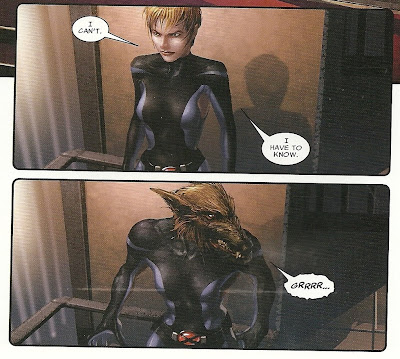
Pretty great, right? Just all of a sudden this lady has a rat head and is saying “GRRRR…” Surreal. Absurdist. Unless you know she was werewolf power, in which it just looks like she has a badly-drawn wolf-head all of a sudden, than that Crain just dropped a new figure in on top of the same background panel so he could use it twice, and save on drawing/artistry.Here is the first panel in which the official X-Force team all appears together. I laughed out loud when I first saw this panel, and can only imagine it would be even funnier if I had no idea who the hell these people were supposed to be:
I would assume Warpath was cruising the park at night and tried to pick up Wolverine, unaware that Wolverine was waiting for a date, if it weren’t for the girl on the ground, whose butt Wolverine seems pretty pissed off about. And check out Warpath’s arms! One of the things I hate about this level of representational coloring is how ridiculous it makes exaggerated anatomy look. If Crain drew Warpath like that in pencil and ink and it were colored the old-fashioned way, it would look like a cartoony superhero design. But with realistic-looking flesh over that bicep that’s almost as big as Warpath’s torso? He just looks like a grossly deformed man-thing. The photo-realistic night-sky and trees don’t help any.
Crain’s art is pretty poor in general, with every panel looking like a still from a not very good video game from 2002 or so—Mortal Kombat fumetti. I’ve read comics he’s illustrated before and not minded the art in them at all—his 2005 Ghost Rider series with Garth Ennis, for example—but I hated it here. It was hard to read, in addition to just being hard to look at, and there are panels where certain actions are meant to be taking place that don’t make any visual sense, but must be figured out using context clues, like when you’re a little kid reading a book and you see a word you don’t know, but can guess its meaning from the way its used. Only with comics, and the unknown vocabulary word is just a crappy panel with stranger blurs meant to evoke motion of some kind.
If I had to guess, I think a big difference between that Ghost Rider comic and this X-Force one is that motorcycles, chains, fire, skulls and demons look more natural in this video game-paint style, whereas flesh and blood humans—even spandex-clad ones—look gross and off-putting and, obviously, hard to “read” emotion or even motion from. And nighttime highways and Hell are easier settings to fudge than the real-world settings of this X-Men comic.
Here’s something I didn’t know about X-23:
Apparently, she is a “cutter.” That is, the slangier way of referring to someone who suffers from the behavioral and/or mental disorder of self-harming, usually with non-suicidal tendencies. Unlike most cutters, Laura has several blades conveniently stored inside her own forearm. And she has a healing factor which immediately repairs the self-harm she does, which makes the whole thing kind of…odd. And, I think, sort of crass and insensitive.
These panels are the only reference to this among the 300 pages of X-Force Vol. 1; perhaps the ramifications are discussed in greater detail and with greater sensitivity elsewhere.
This is probably my favorite, “God, this comic must seem weird” moment in X-Force. The epilogue for issue #10, the conclusion of the “Old Ghosts” storyline, features a wolf running through the snow, panting, when it gets knocked down. And, on the next page:
Holy shit! This X-Men comic is suddenly about furries?!That male furry only appears in that panel, and that’s his only line, so, um, not sure what’s up with that. Is he a recurring character, that X-Force/-Men/New Mutants fans will immediately recognize, or does that page seem just as out-of-left field to them as it does to me?
Okay, let’s take a look at “Ain’t No Dog,” or, as I like to think of it, “The Good Part.”
This is a clever, perfectly constructed 21-page story which opens with Wolverine in front of a bound and gagged man, holding his own spilled guts in while he waits for his healing factor to fix him, sitting around in a pool of blood spilled from himself and the various dead bodies scattered around.
He’s there to get something from someone, but first he has to fight a bunch of mindless berserker cannon fodder that chants "KILL KILL KILL." He does all the talking in the book, to the gagged man, save for one scene with Cyclops told in flashback.
Huston does a fine job of doling out information efficiently and dramatically, in such a way that the reader gets it when the reader needs it, and can put the story together for him or herself as the story is read. He has a lot of fun with Marvel’s Quesada-era no smoking policy (more on that later) in the process. And the story both fits in with what was going on in the main X-Force book the one-shot containing it spun out of and stands alone (at least one of the bad guys Wolvie kills is wearing a Purifier uniform).
With the possible exception of Urusov’s flashbacks, this the best X-Force looks. Jefte Palo’s Wolverine is rather Frank Miller like, as is his entire comic. Not necessarily in terms of design, which is detailed and round where it needs to be, but in the starkness of the juxtaposition between shape and space. And some little details, like Wolverine in profile, the way he pulls on his mask, or the way the bodies of ninjas pile up around him.
Palo and colorist Lee Loughridge do neat work with the copious amounts of blood as well. The borders around the spilling or spilled blood aren’t inked, so it has an almost unreal, luminescent effect to it accomplished by a lack of black (rather than a computer-added lens flare effect), and it looks like red paint. It’s beautiful, which allows the reader to see it as the protagonist sees it, and the result is a story in which there is literally vats of blood spilled, but while its bloody, it’s not gory or gross. A little artifice goes a long way…especially in art.
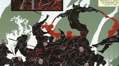
For example, here’s how Crain draws a scene in which a couple of guys have parts of their heads cut off:
And here’s how Palo draws a scene in which a guy gets his head cut into pieces by Wolverine:
Discussion of art can get tricky when you stop to wonder if you’re factoring in personal taste or preference when evaluating quality, but I don’t know—the one image seems so much better than the other, even in terms as simple as legibility, that I don’t see much room for uncertainty regarding quality here. And that’s X-Force Vol. 1, which isn’t at all as good as Uncanny X-Force Vol. 1, but is at least big (I borrowed it from the library; you should too if you’re interested, because it sure ain’t worth $35) and has some funny bits, even if they’re not meant to be funny, and at least one really good story in it.
Oh wait, before we go, here’s the last page of “Ain’t No Dog,” which you shouldn’t read if you don’t want Huston’s best joke spoiled:
There are two references earlier in the story to the fact that Wolverine used to smoke but no longner does. See, smoking is really bad, but killing enough dudes to form a twelve-foot pile or corpses to perch upon? That’s not as bad as smoking.I think that’s pretty cool that Marvel let Huston essentially get away with saying “Quesada’s policy regarding smoking in Marvel Comics is fucking insane.”
Wait, one more image. Since I wasn’t terribly kind to Crain, I should also point out this variant cover to the first issue by Bryan Hitch, whom we all generally consider a pretty good artist.
That image sucks. (Is it something about the word “X-Force” that brings out bad work in artists? Is it a magical word that executes a “draw worse” spell? Is Rob Liefeld a warlock, and did he place a curse on the property when he left in the early ‘90s…?) Is Warpath’s mutant power that he’s fucking gigantic, or are X-23 and Wolfsbane only about three-feet tall? How unusual is it for a man's butt to be that much smaller than his head?
Sunday, November 27, 2011
I suppose I might as well read Astonishing X-Men Vol. 5: Ghost Box
Having previously read the rest of Warren Ellis’ run on Astonishing X-Men (Astonishing X-Men Vol. 6: Exogenetic and Astonishing X-Men: Xenogenesis), I figured I might as well track down Astonishing X-Men Vol. 5: Ghost Box as well. This was Ellis’ first arc on the series, following the four arcs/volumes by writer Joss Whedon and artist John Cassaday. For it, Ellis was teamed by Simone Bianchi.
Now, reading the series more or less backwards through the collections isn’t the way I’d recommend doing it, although each story arc is self-contained enough that it doesn’t matter overmuch. Reading them all now, and putting them in order in my memory, it’s clear Ellis was working through a series of big action plots stemming from the events of some of the mutant-centric events (House of M’s decimation of the homo superior species, the “Manifest Destiny”-branded move to the West Coast, first from San Francisco and then onto a little island apparently un-ironically called Utopia, etc). But, more importantly, while he was doing that, he had some broad characterizations of the main cast—the cast of Whedon and Cassaday’s run, minus Kitty Pryde and Colossus, plus Storm—and some ongoing conflicts that several of them would really wrestle with, including Cyclops’ struggle to be a Professor X-like leader during a time when a Magneto-like leader might be more successful, and Beast’s struggles to scientifically un-do what the Scarlet Witch magically did to mutants way back in House of M.
The plot in this storyline was a lot more complicated than those in some of the later volumes Ellis wrote, perhaps not necessarily in terms of a summary, but rather in terms of presentations.
That plot basically boils down to this: the mutant super-team stumbles upon a secret war between two factions of super-mutants that can’t possibly be of this universe (given what the smart mutant knows about science) and they must save the world from an overwhelming invasion force, discovering along the way that someone from their past is heavily involved.
But Ellis introduces it in a rather twisty and turny way, which makes the read surprising and engaging, at least when read in a trade collection. I imagine it just read boring when a reader had to way 30 day to 30 months between late installments.
When the San Francisco Police Department find an exceptionally exotic corpse, apparently killed in an exceptionally exotic manner, they call in the X-Men to consult, and they start following the clues, which takes them all around the world and fighting some mad-science monsters and invaders and encountering tons of Ellis-style super-science, while trading withering remarks with one another.
It’s essentially a perfect script for an X-comic.
I was exceptionally—or should I say X-ceptionally? Ha ha ha (NO. No I should not say that)—surprised by Bianchis’ artwork, which was, in terms of rendering, better-planned, better-thought-out and overall better drawn than much of what you might find on the super-comics shelves, more closely resembling a European album comic than Big Two artwork. Bianchi and Andrea Silvestri provide ink washes over the pencils, which no doubt adds to its painterly-like look, and Simone Peruzzi, Bianchi and three others all provide colors, although the three involved seem to be among Marvel’s better colorists.
Now, while Bianchi’s design and rendering skills are pretty incredible, I’m not sure I’ve completely made up my mind about the overall quality of his work after reading this one story. It’s not always clear what’s going on, and he makes extremely interesting choices, particularly in laying out his panels and depicting action (Near the climax, for example, the team splits into three sub-teams, and each fights a different threat; only the Wolverine/Armor fight scene is terrible legible, and that’s mostly because it simply involves a guy kneeing and stabbing another guy using his knife-fist, rather than gymnastics or lasers or super-powers).
But even if the flow of a page gets all-tangled up here or there, or if it’s impossible to understand why Bianchi chose to draw a page’s worth of action in the format he did, they are always interesting-looking pages to take in, consider and figure out.
I loved the way the characters looked, and I loved reading the art—even when I was trying to read it as much I was actually reading it, if that makes sense.
Let’s look at the images, shall we?
First, I wanted to draw special attention to Storm’s costuming:
Bianchi does redesigns for all of the characters, some major and some extremely minor, and his Storm is perhaps the more radical one. As I mentioned of Phil Jimenez’s version of Storm in a letter volume of the series, it’s a combination of her original costume with her ‘90s embrace of the color white, but Bianchi adds a great deal of filigree, suggesting a sci-fi super-goddess and the Queen of a sort of African above-ground Atlantis like Wakanda.The back of the book includes some design sketches, and I’ve just included The Storm one, as it offers the best view of the whole shebang. I should note that Bianchi’s drawing of it is the first time I ever understood what exactly that weird shape in Storm’s hair was really supposed to be.
I always thought it was some sort of huge goofy pick or headband, but now I see the strange shape is merely suspended around a ring that encircles the head, which makes more sense.
I was kind of alarmed by the first page of the book, which opened with a three-panel grid, the top one of which featured a panel approximating Armor’s Twitter account, and I worried that it would be a device that runs through the entire story. Luckily it didn’t, but those first few pages are awfully off-putting, no so much grids, as panels of various shapes stacked Tetrisly, even Dr. Mario-like on the white pages, with elements bleeding out of certain borders, and some black matting effects below certain panels.
The craziest thing about the page, however, in which we’re first introduced to Armor, Wolverine and Beast, is the Wolvie intro:
I guess maybe I’m just not familiar enough with San Francisco to recognize what the hell is going on, but is Wolverine in the San Francisco Zoo or something? Or is there a place somewhere in which there’s a pagoda and some bison? And what’s up with that one laying on the ground? Is it dead? Do Buffalo sleep like that? Or did Wolverine kill it? Or just tip it, like rural teenagers might do to a cow? (Help me, San Francisco-based comics retailer and writer-about-comics Brian Hibbs!)
As cool as it would be if Wolverine’s actual superhero costume was just a pair of black briefs, Bianchi’s redesign is actually a version of the yellow and blue scuba-diving suit with a cowl shaped like Wolverine’s hair-style.
The most noticeable modification is the holes for Wolverine’s ears, but what really struck me was the eyes:
Sometimes Bianchi depicts them like Alex Ross draws Batman’s mask, as a sort of perfectly-fitted affair in which just enough material has been cut away to allow only the hero’s eye-balls and nothing else around them to be revealed.Other times, it looks like maybe Wolvie has really wide eye-holes, and has simply painted the area around his eyes, although I can’t see any borders to suggest eye-holes.
So I don’t know exactly what’s up with Wolverine’s mask but, again, I like it despite being unclear about it. It’s a very expressive sort of depiction, in which the character is both wearing a mask and not wearing a mask at the same time, and Logan the person and Wolverine the superhero, the skin and the costume, the representation and the emotional content overlap.
One of the funnier parts of the book was probably unintentional. When the team gets the call to go consult on a crime scene, Cyclops announces “Street tactical gear,” and then we see them all dress like…this:
Cyclops explains to Storm that the idea is to not have on superhero costumes, as cops associate costumes with vigilantes and, given the state of the Marvel Universe the last few years, people associate them with “government flunky or illegal combatant, which is one step away from being a flying terrorist.”I don’t quite understand why their “street” clothes look so goddam garishly insane though. Only Wolverine seems to be dressed “normal.” Couldn’t they just wear, like, suits, or dress business casual? Why all the cargo pockets and vests and boots? Why does Emma Frost look like she’s wearing a white version of a Operation: Desert Storm uniform, with a choker, for some reason?
Let’s look at some of Bianchi’s interesting panel lay-outs, from two non-consecutive pages:

Note the jumbled nature of the first page, and the apparently randomly shaped panels that it consists of.I chose the bottom example because it's one of the many instances in the story where Bianchi embeds a panel within a figure. Here, there's a panel with Cyclops' face in it, within the borders of Cyclops hip. (If it weren't so late at night as I type this, I would pause for a few minutes to think how to set-up a "Cyclops is literally talking out of his own ass" joke at this point).
And here’s one of the previously mentioned unintelligible action scenes:
It's probably even harder to make sense of out-of-context like this. It's Beast fighting a "chameleonic" mutant (And saying "RRAAAAHHRRR"). The bad guy is the thing that has the green netting all-over it, like an unfinished special effect from a few years ago. Beast apparently jumps into it and makes it explode somehow. Note all the little Beasts all over the page though. Generally, less-solid figures would show where the character was in the recent past, so the one saying "RRAAAAHHRRR" is the second most recent Beast, while the one kicking is the final or "present" Beast. The others are all older Beasts. I can't really follow the actions they are meant to depict though, not in any chronological, linear fashion. The lack of background sure doesn't help any, either. I’d highly recommend the book if you like superhero comics, particularly ones featuring Marvel’s mutants. (Or if you have any curiosity about them; Ellis’ entire run seems to have a particularly low-threshold of X-knowledge and -appreciation necessary to enjoy, and to boast some fairly great artwork, the ugly coloring on Exogenetic aside).
After writing a few more paragraphs, doing a heck of a lot of scanning and looking more closely at all those pages, I’m still not sure how good Bianchi’s art is, but its definitely great, and fun to read and to look at.
Oh, it should also be noted that the collection features a few vignettes from a two-part miniseries Astonishing X-Men: Ghost Boxes that Marvel published, apparently to keep some AXM content on shelves during delays. They are written by Ellis, and are kinda sorta related to the main story, but I had trouble making heads-or-tails of them, as they move in and out of different alternate realities. Clayton Crain, Kaare Andrews, Adi Granov and Alan Davis and Mark Farmer draw the various scenes, and those are about as different as any four art teams assembled can be. They’re each good in their own ways, the Andrews and Davis/Farmer ones especially so, but they all clash violently off one another, and I found the story-like sequence they form confusing to the point that trying to read it was practically upsetting.
I guess it is fun to see what Davis does with Bianchi’s redesigned Storm costume though…
Saturday, November 05, 2011
Recent Marvel Trades I Waited For (Pt. 3): Astonishing X-Men: Xenogenesis
Regular readers will know that I was really excited about this particular miniseries, as it paired the reliably good writer of pretty smart superhero comics Warren Ellis with the amazingly talented (but rather infrequent) drawer of comics Kaare Andrews, and Marvel’s solicitations of the cover images included a cover in which Andrews rather radically redesigns the characters (in relation to one another, at least; they still look like “themselves,” just exaggeratedly so) and another which is one of my favorite superhero images of all time
(Like the image of Arsenal clutching a dead cat from Rise of Arsenal, Emma Frost eating pancakes on top of a crawling Scott Summers is something that I don’t seem to ever stop finidng amusing) and others that include a baby vomiting down the cut-away cleavage-revealing part of Emma’s costume and the X-Men apparently about to fight a bunch of babies. I was not disappointed by the series itself, although I should again note that my enjoyment of it likely had a lot to do with being able to read it in a single sitting and for free, rather than paying for $4 for 20 pages of it every month or four (The schedule was rather erratic, with some severe delays, if I'm remembering correctly).
I imagine it must have sucked reading it serially. Ellis and Andrews pace it a little like a slightly more staid than usual shonen manga, with a lot of splash pages, characters posed atop stacks of panels, breaking out of the borders, and hardly any pages containing more than three or four panels.
The individual issues must therefore have read blindingly quick. The second issue, for example, opens with a one-page splash featuring a close-up of Cyclops’ face, as he says something tough. That’s followed immediately by a two-page splash of Cyclops eye-beaming a bunch of soldiers (the image reveals Cyclops in the middle-distance from behind, while a bunch of silhouettes fall down like bowling pins and the background turns red), and that’s followed immediately by another two-page splash, this one featuring all six of the X-Men rushing at the viewer in various about-to-fight poses, and then that is followed immediately by a one-page splash of four of them engaging in fisticuffs with the nameless soldiers, Storm and Armor delivering curt fight-chatter quips.
All together, that’s almost a 1/4 of the issue devoted to just four panels, and each of those moments is diminished by the poor pacing; if everything is a splash, nothing seems worthy of a splash.
Andrews’ art is great, but he does nothing with those four panels that he couldn’t have done better if each page had four of it’s own panels.
I liked Ellis’ plot for this one better than his plot for Exogenetic, as there seems to be a bit more going on, and a lot more of it more interesting than the series of fights in that storyline. Additionally, all of the six leads in the ensemble—Cyclops, Emma Frost, Wolverine, Armor, Beast and Storm—have something particular to do in the story and justify their presence in it (I mention this mainly as a contrast to Bendis’ Avengers arc that I wrote about earlier in this series of reviews, wherein the characters featured seemed to be there moreso because Bendis liked them then because they had anything to do with the story they were presumably starring in).
The mutant race remains on the ropes, on the brink of extinction after the weird-ass events of Houes of M, so the X-folks get pretty excited when they hear about a town in an African country where a bunch of mutant babies with strange and dangerous new powers have been born. Even though they can’t possibly be the same sort of homo superior mutants that make up the ranks of the X-gene mutants (as they are born with their powers, rather than developing them at puberty), they decide to check it out.
There they discover Joshua “Doctor Crocodile” N’Dingi, the leader of the country with the baby problem, who intends to execute all the babies. The source of their mutations is quite exotic, and one I’ve never seen in comics before (N’Dingi and origin story he tells may have occurred in previous Marvel mutant comics; I don’t know). Essentially it is a symptom of an act that brings about an even greater threat, and the X-Men have to thread the needle between various threats—one of which is potentially apocalyptic–in order to save the most people.
I was again quite impressed with both Ellis’ plotting and his dialogue and characterization. It was a smart, fun, funny, action-packed superhero comic, an a spefically X-Men one, in which the mutant heroes deal with the sorts of issues that are endemic to being mutant superheroes.
(And, once again, I was struck by how Ellis’ X-Men bear so much in common with Morrison’s, this time including shedding their superhero fight-suits in order to wear relief worker-like uniforms, so they look more like they are there to help and less like they are there to kick-ass. Well, everyone but Emma changes clothes; she gets to wear another version of her tight, white and revealing wardrobe of costumes, explaining, “Darling, if you were sleeping with the leader of the pack, you too could wear what you liked.”)
(Here’s a terrible scan of them disembarking, which also gets a two-page spread).
As good as the writing is, however, what separates this from the pack (Actually, is “pack” even a big enough metaphor for X-Men comics in 2011? Should I have said “what separates this from the herd” instead….?) is Andrews’ incredible design work. His Cyclops isn’t just tall, but built like an action star to boot. Storm is built like his female equivalent, only she’s even taller. Wolverine is short and squat. Emma tiny in comparison to her lover Cyclops, and even Wolvie, and she’s all curves and round shapes (not he forehead whenever she’s in profile). Armor is similarly small, and slim to the point of being gamine (Andrews draws her armor in extremely exaggerated fashion, so it looks like a red, glowing fetal mecha battle-suit). Beast is giant, and usually crouched so as to give him a sort of dome-like shape. Andrews has given Storm her mohawk back, presumably just because it looks cool, although her her hair remains long, somewhere between that of George Perez’s Starfire and that of Rapunzel’s; Emma also has head of hair that follows her like a comet trail.
Andrews’ art is colored by Frank D’Armata, just as Phil Jimenez’s was, and it bears many of the same weakness, including blurred backgrounds to simulate a movie camera focusing on the foreground, but D’Armata’s special effects are less oppressive here. He eschews attempts to blur characters to imply action, for example, perhaps because Andrews does so much with whipping hair and nearly horizontally positioning characters when they’re running or fighting that to blur them would be superfluous.
I suspect it has a lot to do with the lighter, brighter setting—most of the book takes place outside in bright, sunny daytime Africa—and Andrews’ characters taking up so much space and containing so many fewer lines than Jimenez’s more tightly-packed pages full of more realistic renderings. Just a guess though; maybe the editor was like, “Jesus man, tone it down next time, huh?” after seeing how “Exogenetic” turned out, or maybe he used up his allowance of special effects there.
Now let’s look at some of that awesome Andrews art, shall we?
Here's a panel from rather early in the first issue, in which the X-People hang out in the kitchen and discuss what Storm's husband The Black Panther told her about the mutant births, and whether or not it's X-Men business:
Note how much Andrews is able to characterize the various characters and their roles in the ensemble by their postures in this panel. It's a pretty great scene and, though it's essentially an all-talk scene, it's really livened up by the nice touches like Beast perching like a gargoyle on the counter, or Armor and Emma's expressions. There's another talky scene later in the same issue, wherein Wolverine and Emma talk about Africa on the jet plane ride over. Note the...well, you'll note immediately what's noteworthy about this page:
I like how Andrews is able to not only design the panels around her boobs, but to do so with every single panel on the page, including the one where one of her breasts just sort of juts into a panel containing Wolverine's head. I particularly like how Andrews is able to draw a page of repeated panels ogling Emma Frost, and to do so in such an extreme way that he seems to be simultaneously making fun of comic book artists ogling their female superheroine stars while engaging in it himself. And, of course, he gets away with it here because it's Emma Frost, who is often written as something of an outgoing, sensual, sexually-aggressive character constantly displaying herself (It's not just the costumes, of course; in this story she psychically gifts various medical personnel the ability to all speak the same language by making out with them. Later, when Scott asks her to do something with her psychic powers, he asks her to try doing it without licking anyone).
Finally, there's Armor's reaction to Emma presenting her breasts to Wolverine in that final panel.
The collection includes the script for the first issue, which allows us to consult it to see what Ellis specifically noted and what Andrews added to the scenes. This scene? The worlds are all Ellis, but everything else is all Andrews.
Here are a few images of Wolverine, who was dealt a bunch of mortal blows by the invincible enemies the X-Men must face in this story, but he doesn't die (obviously) due to his amazing healing factor. I love just how physically destroyed Andrews makes Wolverine look in these panels:

In the top image he is literally holding his own spilled guts, while an enemy points a giant laser gun point blank at his head. In the bottom one, he's got big cartoon character-sized holes in him, as if someone took a hole-puncher to Daffy Duck or something. Only with, you know, more gore. How could he even use his right arm to stab someone's head (as he does in the inset panel) when his shoulder muscle is just plain...missing? Oh, and before I end this fawning little "Kaare Andrews is awesome" gush, I suppose I should address the question of what on Earth happens in the issue containing this cover.
Are you ready for this? Emma uses her powers to commandeer the brains of the enemy soldiers, Doctor Crocodile explains exactly what's up with the babies and how he gained the appearance that lead to his nickname, there's an argument over whether the babies should all be executed or not, and then an incredible threat appears. And that's it. No pancakes. No playing horsey. Why does this image even exist?
Because Kaare Andrews is awesome. That is the only answer I can come up with.
***********************
Hey, wait a minute...
Wait, make that two minutes...
Tuesday, November 01, 2011
Recent Marvel Trades I Waited For (Pt. 2): Astonishing X-Men Vol. 6: Exogenetic
After Grant Morrison, Frank Quitely and a passel of talented artists reinvented Marvel’s moribund and morbidly obese X-Men franchise into something new and cool and fresh for the 21st century in 2001-2004's New X-Men, Marvel characteristically decided to order a full retreat from the new.So the title "New X-Men" was repurposed for a book showcasing the youngest, newest teenage mutants (since New New Mutants just sounds silly), and the flagship book became the newly launched Astonishing X-Men. In the first issue of the new series, leader Cyclops formally announced to character and readers alike the game plan—The X-Men were going back to being superheroes.
To help keep complaints to a minimum, Marvel turned to fan-turned-Hollywood script-writer-turned-television superstar-turned-nerd celebrity-turned-budding comic book writer Joss Whedon (that was, in industry parlance, a major “get”) and Planetary artist John Cassaday.
The book was pretty good when it came out, but it never came out. I read and liked the first two story arcs, and then quit paying attention during one of the many-months stretches between issues.
To follow the Whedon/Cassaday team’s 24–issue run, Marvel tried hard to assemble another creative team who would keep the book off the shelves for long stretches of time, writer Warren Ellis (an ideal X-Men comics writer, and probably the writer Marvel should have tapped to follow Morrison, had they truly wanted to follow Morrison instead of pull a 180 of course correction) and Simone Bianchi, an extremely gifted designer and cover artist who was slow enough to match Cassaday’s pace.
I didn’t read their story arc—collected as Vol. 5: Ghost Box—either, as by that point I had sort of forgotten about the X-Men again, and all I had ever heard about that story was how evil Marvel was being in their pricing of it (Rather than charging $4 for 22 or 20 pages of story, I think there was an issue of “Ghost Boxes” with less than 20 pages, and a bunch of sketches or whatever to fill up the back...? Am I remembering correctly...?).
And what followed that?
Well, like I said, I had pretty much tuned the title and the characters out, and hadn’t given it a thought until Marvel started releasing images like these to promote the miniseries spin-off that Kaare Andrews would be illustrating:


(These are among some of the best Marvel covers of the last 10 years, by the way).And then the other day in the library I saw this, and realized what I had missed:
Naturally, I brought it home from the library with me, read it, re-read it, and then decided to blog about it. Which brings us all up to speed, right?
This volume includes the story arc “Exogenetic,” which reads just like a lot of Ellis’ comics scripts do—like surprisingly finished storyboards for a blockbuster action movie. That is either a virtue or an extreme irritant, depending on how you encounter the story.
Read all at once in a single sitting, it’s a virtue, and the comic seems fast-paced, action packed, and built around set-pieces and one-liners, with just enough clever character work, funny jokes and a few interesting moral and/or scientific ideas that you feel smarter having experienced it, rather than dumber (as in the case of experiencing an actual Hollywood blockbuster action movie).
Read 20-pages at a time, with 30-to-90 days in between installments, and being charged $20 in a $4 per-installment payment plan, it’s an extreme irritant, and it continues to baffle me that there are enough people who enjoy that sort of experience that it makes sense for a big publisher to continue to make stories like that.
The opening set-piece involves Agent Brand of S.W.O.R.D. (the acronym-ed agency that works the alien beat in the Marvel Universe) on a fairly routine mission exterminating some old X-Men alien enemies, a mission that goes really wrong, and it’s up to the X-Men to save her and the city of San Francisco, which she is plummeting towards. And then a Sentinel (giant mutant-hunting robot, for the X-nostics in the reading audience) made entirely out of meat, which can shoot Brood aliens out of its finger tips (the Brood are basically just the Aliens from the Alien/s movies, but with eyes) attacks.
Increasingly gigantic threats of a similar nature continue to attack the Astonishing team, each a heavily modified and/or creepy and weird riff on a classic X-Men antagonist. The team follow the trail of apocalyptic threats back to their source, which is an unusual villain with a great M.O.
(And part of the reason I found it so great was that it was something I used to think and worry about when I was a teenager. My first exposure to Marvel’s merry mutants came about through that awesomely, hilariously shitty cartoon on Fox in the ‘90s, and it always bugged me that the mutants were so angsty about basically being normal people, only better-looking and with super-powers and they lived in a mansion with a holographic play room and jet planes and a bunch of other super-powered hotties; they seemed dealt an infinitely better hand than the only other mutant heroes I had much experience with, The Teenage Mutant Ninja Turtles, who were so deformed they had to hide their very existence from the entire world, and lived in a fucking sewer.)
It might be selling it short to describe it as a series of action set-pieces climaxing with a classic to kill or not to kill superhero moral dilemma, but that’s what it is. It’s too Ellis’ credit that he writes the characters, their dialogue and their relationships so well that it’s difficult to notice that’s all the story really is; or, if not notice, than at least care.
Yes, I found myself thinking, okay, sure, this is just The Astonishing X-Men and Storm and Agent Brand getting in a bunch of big fights until Scott gets to think long and hard about maybe laser-blasting a bad guy to death instead of arresting him, but I don’t care, because I like hanging out with Ellis and Jimenez’s versions of these characters so much.
We’ve seen Jimenez draw the X-Men before, but he’s an extremely good fit with Ellis’ version of them. Like Morrison, Ellis is a “realistic” writer of super-comics; while the latter started from the premise of mutants as a mainstreaming genetic minority treated as an ethnic and/or cultural minority, Ellis compromises Whedon’s mutants-as-superheroes and Morrison’s rescue/emergency forces and humanitarian (mutantarian?) concern takes, and he writes their dialogue with the sort of withering sarcasm born of lifelong friendships and explains the nutty super-science in a way that at least seems vaguely plausible, if not exactly something on the cusp of being reproduced in laboratories in the next 50 years (There’s a gigantic Sauron in this comics, which means not only does the reader have to accept a were-pterodactyl energy vampire, but a Godzilla-sized clone of a were-pterodactyl energy vampire).Jimenez is incredibly gifted at rendering people, and his superheroes all have the benefit of looking like actual people in good shape and with generally cool costumes, rather than any sort of exaggerated cartoon (Not that there’s anything wrong with that, of course). He gets to draw a generous swathe of X-Men antagonists in the course of the story, generally altered in some way, so that Jimenez is both, say, drawing a Sentinel and drawing a new take on a Sentinel. Because of the realistic nature of his drawing style, even these horribly ridiculous villains and dangers borrow the feel of the main characters. Simply put, Jimenez draws a perfectly little super-comic world, in which all of the elements seem to belong and they all flow together rather than clashing against one another.
He does a pretty great job designing the characters and costumes, too.
I really liked his Storm. Not only does she look like “herself” (regal, imposing and at least half-a-head taller than everyone else), but he gives her a new costume that is essentially just her original black costume, only in white, the color that she became more associated with post-‘90s.
Jimenez does a swell job with Armor too. She looks like a teenager, she looks like a real person, and, when she’s wearing her energy armor, it has one look and she has another, and both are present at once; that is, even though she’s wearing an abstracted cartoon character made of red energy, she’s still herself inside it.
I could imagine myself still reading X-Men comics regularly if Jimenez was drawing them instead of Greg Land or whoever. That said, however, I suppose I should note that Jimenez’s pencils, finished and inked by his frequent collaborator Andy Lanning, are here colored by Frank D’Armata, who seems to be doing his level best to overpower the art with effects so as to make it look as awful as most of Marvel’s modern “house style” comics.
Between the blurring of lines to replicate the focusing of movie cameras or to simulate motion (a weakness of film being replicated in a medium that is itself immune to that weakness) and the glowing lights and flares, far too many of the panels are far too hard to read.
Do you need to wear glasses to read? If so, then a lot of these panels look like they would if you tried reading them without your glasses.
Do you not need to wear glasses to read? Hmm. Then I don’t really have a good metaphor. I guess they just look out of focus. And apparently Marvel wanted them to look out of focus. Because it looks more like a movie that way? I don’t know. Personally, I’d rather see speed lines in good old-fashioned ink, and lightning bolts and laser beams drawn by Jimenez and Lanning’s hands, rather than dropped in later from some computer program so that it looks like Storm bought her super-powers at Spencer Gifts at the mall and that Cyclops' eye-beams have the power to obliterate images.
But I am an old man of 34. I don’t know what the kids like today. Based on my reading of this and too much Marvel output, I would have to assume what the kids like today are murky, sickly shadows, lens flares and blurry backgrounds.
***********************
Next up: Ellis and Kaare Andrews’ Astonishing X-Men: Xenogenesis! Yes, Ellis wrote one story called “Exogenetic” and then later wrote one called “Xenogenesis.” He apparently made a bet with his editor that he would use only the first 12 Scrabble tiles he pulled out of the bag to title all his stories.
That is the trade that contains the comic with this cover:
So we’ll finally learn what the hell happened inside that issue to justify that cover. I can’t wait! Can you? Well, you have to!
Subscribe to:
Posts (Atom)


