Showing posts with label pugh. Show all posts

Monday, May 16, 2016

I'm not entirely sure the term "Celestial" means the same thing in the Marvel Universe that it does in our universe

In the previously reviewed Age of Ultron Vs. Marvel Zombies, the Hank Pym from the Old West domain of 1872 is introduced by the modern Marvel Universe version of OT* Jim Hammond to his girlfriend in this universe, Ryoko/Radiance, who is Japanese. Pym immediately refers to her as a "Celstial," and she responds quite awkwardly.

I actually had to read through this sequence twice before I realized what writer James Robinson was getting at. By having 19th Century Pym refer to Radiance as a "Celestial," he meant "a Chinese person," as that was a common term for Chinese immigrants to English-speaking countries at the time, as China was sometimes referred to as "The Celestial Kingdom."

It obviously fell out of disuse, and I'm honestly not entirely sure how derogatory a term it actually was at the time. Using it today would be similar to using "colored" or "negro," I suppose, as those were once widely acceptable terms in mass media in generations past, but are so archaic that they are know only used negatively, and guaranteed to cause offense. There are certainly much stronger racial slurs to use for both Chinese people and black people today...as there were in the late 19th century, too.

And then there's the whole thing about applying an old-timey term for Chinese person to a Japanese person.

Of course, in the Marvel Universe, a "Celestial" is also a term that refers to a race of astronomically ancient, god-like alien beings that are part of that fictional shared-setting's creation myth, being responsible for the creation of the universe, life and death (They were, of course, created by Jack Kirby, like so many of the foundational elements of the Marvel Universe; he created the Celestials in 1976 in his book Eternals).

Since the Ryoko of this particular scene (and comic) is apparently the one from the modern Marvel Universe (where Robinson and artist Marc Laming created her in Robinson's short-lived All-New Invaders book) and the grand-daughter of a World War II vet, I wonder, wouldn't she think of those Celestials first (um, as I did), before the 19th term for people from China in the U.S., England and other English-speaking countries?

On the other hand, the Kirby Celestials are generally depicted as gigantic humanoid creatures encased in Kirby-esque armor, so maybe she would think of the old-timey term first...


*Original Torch

Sunday, October 05, 2014

Review: All-New Invaders Vol. 1: Gods and Soldiers

I was initially a little surprised, and even slightly put off, by the announcement of this new series featuring Marvel's original Golden Age superhero team (from back before Marvel was even Marvel).

There didn't seem to be any real organic need for such a team book at this point in time, not with Avengers books sprouting like weeds all over Marvel's shipping schedule, and most of those seemingly co-starring Captain America who would, of course, be anchoring this series as well.

Additionally, the team's line-up was no bigger than that of the Fantastic Four: Captain America, Namor, The Winter Soldier and the original Human Torch, Jim Hammond (The original, Golden Age Vision appears about halfway through this five-issue story arc as well). The last Invaders story I read was a trade collection of the 2010 series Invaders Now, and featured a much more robust team of characters: SHIELD Commander Steve Rogers (formerly Captain America), Captain America James Buchanan "Bucky" Barnes, Namor, The (original) Human Torch, Toro, Spitfire, Union Jack and The (original) Vision. That series, by Alex Ross, Christopher Gage, Caio Reis and others, was very open-ended in its conclusion, with the final pages featuring The Vision intoning, "Though we pursue separate destinies, I have no doubt that should this world have need of us...should freedom ever again be threatened...The INVADERS will answer the call."

Apparently, freedom was never again threatened, and the world had no need of them, as the book did not lead directly into an Invaders ongoing, as it seemed to be positioning itself to do so: All those previously mentioned Avengers teams mush have been doing a pretty alright job defending the world and freedom without any help from Marvel's World War II vets not named Steve Rogers.

While Invaders Now had the super-team reuniting to face the consequences of a terrible decision they were forced to make during the war, the premise for this new, that is, this all-new Invaders series dealt with Marvel super-aliens The Kree, which, at first blush, seemed an usual source of conflict for this handful of Golden Agers. The creative team was an intriguing one, at any rate: Writer James Robinson, who had years of success working with DC Comics' Golden Age character during Starman and JSA and had just left DC (where he was scripting Earth 2) for Marvel (where he was writing not only this book, but also Fantastic Four), and Steve Pugh, also fresh off a DC super-comic assignment (Animal Man).

Despite my reservations and initial puzzlement, the book—or at least the first five issues that make up this collection—are actually pretty good. The collection begins with a completely unnecessary eight-page sequence taken from a goofily titled preview book—All-New Marvel Now! Point One #1—in which new Kree villain Tanalth The Pursuer chats with floating head The Supreme Intelligence about an Asgardian-controlling weapon known as Gods' Whisper that is on Earth, broken into pieces and hidden by three heroes.

The Kree must got there to retrieve the components of the weapons, "even if it makes us Earth's invader." (Get it? Invader? GET IT?!)

Then the book starts over with the first issue of the series. The Kree go after Bucky, Namor and the original Torch, who is trying to live a normal life, posing as a normal, human mechanic in a normal, small town. An attack by a powerful alien warrior scuttles all  that, obviously, and before long, he finds himself in the company of Bucky and Captain America and The Vision.

It turns out that not only did Tanalth and company get the parts of the weapon, they also captured Namor, which necessitates the others going to the Kree homeworld to rescue The Sub-Mariner. Here then it becomes clear how Robinson approached the idea of a new Invaders series. He's taking the team name literally, and having the Invaders invade the Kree. I don't know if it's necessarily clever, or if it's enough to build an ongoing series rather than a miniseries around, but it certainly makes sense.
As to why it's only a handful of heroes—Cap, Bucky, Torch and The Vision—who are planning on taking on the whole Kree empire in order to save Namor, Robinson's answer to that is actually pretty amusing: Namor is such an ass that no one else really likes him enough to try and save him, so it's down to his former Invaders allies to make the attempt (I don't know how true that rings; certainly Captain America's veritable armies of Avengers would follow Cap to do just about anything just because it was him doing the asking, and Namor's own current team of The Illuminati may not love him, but they would likely feel they need him enough to help save him from the clutches of aliens captors, but it's funny, which is good enough for me).

There are a few twists to the story, the biggest of which involves the target of the Gods' Whisper, and how those victims plan to retaliate against the Kree using the same weapon, and Robinson writes three pages of a really great scene between Marvel's original heroes—Cap, Torch and Namor—and then, after Namor flies off, between Cap and Torch, where the former talks the latter into joining the world more fully alongside him.
I'm not sure where Robinson plans on taking the series, and if he plans to include other characters who are in similar situations (Toro in particular, and perhaps Spitfire), but I really like the idea of Captain America keeping some form of The Invaders around just so he has some superheroes his own age to relate to, just as I like the idea of Namor hanging out with the Invaders because they're the only superheroes he really respects enough to enjoy spending any time around.

Pugh has proved to be rather flexible in his art style over the last decade or so, his work on the latest volume of Animal Man not looking much like that of his work on the previous volume of Animal Man and his lush, almost photo-realistic looking work on Hotwire not looking much like either.

His work here finds a nice balance between big, bombastic, classic Marvel superheroics and the more realistic style of modern superhero comics. It reminded me quite a bit of what John Cassaday was doing on Uncanny Avengers, but more smooth and fluid.

I'm not crazy about Captain America's NFL SuperPro-esque current costume, which I think is meant to suggest the costume from the movies, but that's not Pugh's fault. He doesn't make it look cool, but he doesn't draw it any worse than any other artist.

He does tweak the Human Torch's costume, and that looks fantastic—
—classic and modern at the same time. It's a nice, simple, elegant look for the character, who is, of course, going to spend much of his time during action scenes sheathed in flame anyway.

I approached this first volume curious but wary, but I closed it eagerly awaiting the next volume.

***********************

The Skottie Young variant cover for the first issue, included unencumbered in the back, is awesome:
I think it's the fact that only The Human Torch seems happy about the travel arrangements that gets me.

***********************

Not crazy about the new Invaders logo though, as it looks a little too much like they just plugged "Invaders" into the "Avengers" logo-style, which they did:

Saturday, November 02, 2013

New 52 Vs. DC Super-Pets: Animal Man

Carmine Infantino's Animal Man from the pages of Strange Adventures
Created by writer Dave Wood and artist Carmine Infantino for a one-off feature in 1965's Strange Adventure's #180, Buddy Baker was a man temporarily gifted with the power to borrow the abilities of animals in his vicinity (See Brian Cronin's post on Comics Should Be Good here for a scan-filled history of the character in the Silver Age).

He proved popular enough to return a handful of times, eventually earning a proper superhero name and costume, although he remained an extremely minor, even obscure character until writer Grant Morrison and company's late-eighties revival of the character.

The original costume featured an orange, blue and black color combination, which wasn't exactly popular among superheroes, but that was probably what helped generate it: By the late 1960s, they were running out of color combinations for new superheroes.

In the Superman tradition, Animal Man had the first letter of his name emblazoned on his chest, but it's pretty fully integrated into the design, rather than being a logo that looks hung there. He wore goggles and an unusual, head-hugging half-cowl that allowed his hair to breathe (The goggles were no doubt functional as well as identity-concealing, and it looks like he's got some ear-protection built in).  Note the scale-like texture of the costume, and the shape of his gloves and boots.

Brian Bolland's cover for 1990's Animal Man #19

In 1988, DC awarded Animal Man his own title, by writer Grant Morrison and pencil artist Chas Truog. His costume was little changed, the major innovation being the addition of a leather jacket over his costume. Well, given Animal Man's vegetarianism and support of animal rights, it was more likely a pleather jacket. The material of the costume gradually gave way to your more standard superhero spandex as well.

And that was pretty much what Animal Man looked like from then on, save for a few story-specific costume changes, as when he became a "dark" version of himself near the end of Morrison's run, or when he assumed a chimerical form during Jamie Delano's run and finally quit wearing his costume and grew his hair long and white near the end of the first volume of his series in the mid-1990s. In all of his subsequent appearances, he'd look like the version from the Morrison run, sometimes wearing the jacket and sometimes not.
Steve Pugh's cover for 2012's Animal Man #0

Animal Man earned a second, ongoing series when DC relaunched their line under "The New 52" banner in September 2011. The character saw one of the more drastic character redesigns, keeping only the large A design element and the partial cowl. His colors were now blue and white, he no longer wore goggles and rather than having a glove-like element to his costume, the white arms were more sleeve-like, extending up to his torso.

I personally don't like it much, mostly because of how far divorced it is from the original costume that it makes him look like an entirely different character. He looks rather like an X-Man to me ("A" aside), and while orange, blue and black might not have been the best color combination in the world, Animal Man did sort of own blue and orange, whereas blue and white is a color combination that a lot of super-characters use (particularly villains and characters with cold powers).

I don't think the change makes very good business/character evangelization sense, either (The same goes for most of the New 52 redesigns). I understand the idea of signaling the drastic change by so thoroughly redesigning everything—costume tweaks and changes have long been a way to call attention to an old character or a new storyline—but in this case, Animal Man no longer looks like the character that appears in the critically-acclaimed Grant Morrison-written graphic novels (or any of the other Animal Man trades, or in the collections of 52, which featured him among its cast). Nor does he look like the Animal Man in the DC Nation shorts, Animal Man's only real appearance outside the comics medium.

Personally, I prefer the following design.

Art Baltazar's Animal Man from the DC Super-Pets Character Encyclopedia

Animal Man makes an appearance in the DC Super-Pets Character Encyclopedia, as the "Superhero Owner" of Super-Pet King (a lion).

Baltazar keeps the basic color combo—orange suit, blue A, black accessories—as well as the half-cowl and goggles. He streamlines it quite a bit though, so those amoeba-like tendrils at the borders of the boots and gloves that Infantino gave his costume are gone, replaced by straight edges or triangular shapes.

I especially like the little animal touches he adds, like the big, rounded goggles (suggesting an insect's eyes), the leopard or cheetah-like spots near the gloves and boots, and even the little lines suggesting a paw-like boot. There all just little flourishes, but each signal "new" and "different" without actually radically changing the costume (They're more like adding a yellow circle behind Batman's bat-symbol, or taking that yellow circle away, rather than, say, giving Wonder Woman a pair of black pants or Hawkman a suit of golden armor).

I also really like the torn vest, which replaces the problematic leather/pleather jacket (even if it's fake leather, it looks like leather), and might have different connotations to different viewers. With the vest, Animal Man's got a cool accessory to wear over his costume to signal he's a little more hip than the characters who just wear their spandex costumes.

Maybe the next Animal Man series will see Animal Man wearing a costume more like this than his blue and white, New 52 togs. Not much point in re-dressing the current Animal Man in the cooler, Baltazar-designed costume. From what I've read, the new, New 52 Animal Man isn't a very good comic, and seems to be repeating plot lines from the original series (and Swamp Thing), and doing the sorts of things Morrison parodied and criticized in superhero comics during his Animal Man run, without a trace of irony or understanding.

This is, by the way, Example #1 for why Art Baltazar should be the next person DC calls to redesign all their characters, rather than Jim Lee and company.

Monday, September 30, 2013

Review: Animal Man Vol. 3: Rotworld: The Red Kingdom

I thought Animal Man was supposed to be one of the good New 52 books, one of the best comics DC is currently publishing? It's probably the comic I see cited most often in the comments that occasionally attach themselves to pieces I write at Robot 6, or under articles on various blogs about some dumb editorial decision DC has made; you know, things like, "Ugh, DC is the worst, Animal Man is the only book I'm still reading" or "That it, I'm dropping everything but Animal Man" or "Wow, I guess I can drop Batwoman too now, so Animal Man is my last DC comic."

And it's written by Jeff Lemire, a very talented cartoonist and pretty decent super comics-script writer that everyone seems to like, in this volume occasionally collaborating with Scott Snyder, who seems to be the universally accepted Best Writer At DC.

And yet this comic is sort of awful. Granted, I started the series with volume 3 instead of volume 1 (my only previous encounter with New 52 Animal Man being this summer's annual), but what I found wanting about it had absolutely nothing to do with not being able to follow the plot or recognize and understand the characters and their conflicts (all of which were pretty similar to how I remember them from 1990s Vertigo stories); Lemire and Snyder do a fine job of making this volume stand on its own and serve as an easy enough entry point.

Rather, I just found the whole endeavor repetitive (of older, better comics I read as a teenager), and bloodless and cold. It was plain old generic superhero comics, without any interesting or fresh ideas boiling under the surface; the art was occasionally very creepy and weird, and kept my eyes from drifting up from the page to the carpet or wall paper, but it was inconsistent (seven artists were involved in the volume), and rarely inspired enough to make up for the overall deficiencies of the comic.
Steve Pugh's "Rot Queen Maxine" is scary as fuck. Good job, Steve Pugh!
This volume contains eight issues of Animal Man and two of Swamp Thing; despite the 200-page contents, a sizable chunk of the narrative seems to be missing, as the two DC-to-Vertigo-and-back heroes are separated when arriving in Rotworld and go on separate quests that converge; we see the start and climax of both, but Swamp Thing is otherwise MIA, returning with a bunch of characters that weren't introduced and with a deus ex machina not mentioned int his volume until it appears (Given the title, I suspect there's a volume of Swamp Thing out there with the sub-title "Rotworld: The Green Kingdom," but if issues of this aren't reprinted there as well, I have a hard time imagining how complete that story must read).

Buddy Baker, aka Animal Man, is on the run with his family: Wife Ellen, be-mulleted teenage son Cliff, power-sprouting young daughter Maxine, and his mother-in-law. Both she and Ellen are pretty unhappy with Buddy about all the dangerous craziness he brings into their lives, an unhappiness that ultimately culminates with Ellen leaving him. I read issues written by Jamie Delano featuring these very conflicts and events, some of which were drawn by artists Steve Pugh, who drew the lion's share of this volume, increasing the sense of deja vu (The greatest change is that Animal Man's costume is quite different, and he looks like a minor X-Men character. While these issues were being published, there are Animal Man collections written by one of the most popular writers to work with DC in the last twenty years for sale on bookstore shelves, and short cartoons featuring Animal Man on Cartoon Network; he looks completely different. Synergy!).

What they are running from are agents of The Rot, which is the equivalent of The Red, the mystical lifeforce web that binds all animals that Animal Man draws his powers from, and The Green (Replace "animals" with "plants" and "Animal Man" with "Swamp Thing").  Cliff has been injured and seems to be near death, and while the adults argue about how best to help him, ultimately Buddy convinces them they have to stop the problem at its root, by visiting the swamp with a talking cat and allying themselves with Swamp Thing and Abby Arcane, both of whom have slightly different haircuts, but seem to be otherwise immediately recognizable as their mid-nineties Vertigo selves.

The two character with books bearing their names dive into a fetid pool that is a portal into The Rot, and something something, Arcane is the Avatar of The Rot, they end up in a post-apocalyptic, possible, so-sure-to-be-immediately-reversed-this-might-as-well-be-an-Elseworlds-world future in which The Rot has conquered the world, save for a handful of heroes in need of Animal Man and Swamp Thing's leadership to win the day.

In this respect, it reads a lot like (what I've read of) Age of Ultron or sections of Grant Morrison, Howard Porter and John Dell's "Rock of Ages" storyline; there are no consequences, and thus no import, to anything that happens (In fact, a reset button is pushed by cosmic forces near the end, sending the characters back in time to prevent Rotworld from ever coming to pass.

But what it reminded me most of was Jeph Loeb's "Hush" story arc in Batman: A series of cameos, strung together like beads. Many of these are indeed cool, several are completely out-of-left-field (Would Medphyll be in many readers' list of The Top Ten Green Lanterns Most Likely To Appear In a crossover...?*). That is at least one virtue to the parade of Geoff Johns-like guest-star reveals; many of them are relatively minor characters, fan-favorites (as in, like, one fan likes them a whole lot) that probably don't appear as often as they should.

They get a chance to shine, and some cool stuff happens, like Frankenstein joining The Green Lantern Corps.
Black Orchid can morph her hands into big scary monster claws, just like her namesake flower
So Buddy teams up with New 52 Black Orchid, who wears purple cabbage leaves, can change shape and generally looks infinitely worse than the original DCU version or the later version reinvented by Neil Gaiman and Dave McKean (And why would you want her to resemble the version of her appearing in that graphic novel by Neil Gaiman? It's not like millions of people like to read books that guy writes or anything); Beast Boy, who is now red and doesn't look anything like the version in Teen Titans, Young Justice or the new Teen Titans Go cartoons that are on television;  Steel, who is now a robot with his consciousness uploaded; and John Constantine, who apparently must appear in every single comic featuring more than two superheroes in it.

Together they pick up some more allies, like Frankenstein and his Patchwork Horde, an army of sewn together cavalry on sewn-together horses that the Rot can't rot and the aforementioned Medphyll, and fight some villains, like Blackbriar Thorn and Gorilla Grodd and his gorilla army (which Mallah and The Brain are in).
Pugh's cover to Animal Man #13, I think, featuring an awesome Rotworld Hawkman
At Arcane's castle, they meet Swamp Thing's team—a Batgirl who looks like a female Man-Bat, Mister Freeze, a giant Batman robot with the power to fix everything—and get in a big fight with the various forces of The Rot, most of which are corrupted, badly deformed versions of DC superheroes and villains behaving a bit like zombies, only much more fucked-up looking.

A lot of them die horribly, but who cares? It reboots at the end, as is clear from the pages.

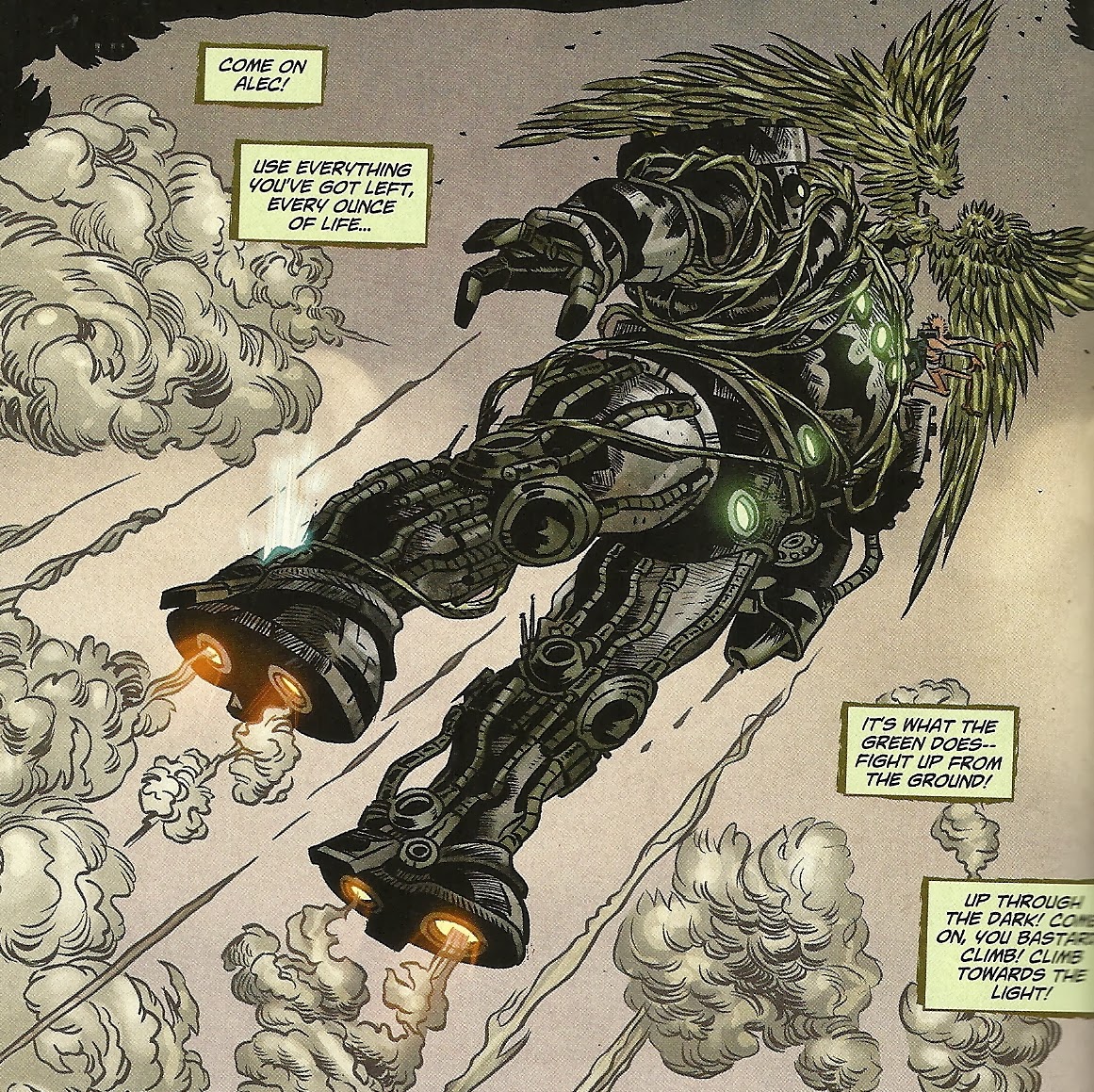
In order to win the day, they have to get the Batman robot-thing up into the clouds, where it will make it green Fix Stuff juice, that will fix stuff. Because this is an Animal Man/Swamp Thing crossover, it falls on them to get it up into the sky, by having Swamp Thing grow wings made of plants (?) and fly it, while Animal Man fights Arcane atop it.
Artist Andrew Belanger takes over for the climax, because that's when you wanna see a different artist come in. I'm no botanist, so I don't know how much metal a pair of leaf wings can carry
This is sort of weird, since Green Lantern Frankenstein, who has a magic ring that specializes in allowing its bearer to fly and in lifting heavy objects, usually in green spheres or giant green hands, keep the hordes at bay. This would be a little like a Justice League story where Superman is like, "Batman, I'll keep these thugs off your back while you  fly that nuclear missile up into space where it won't hurt anyone when it goes off in thirty seconds!"

And then, back in the past, Cliff dies, which is actually more funny and sigh-inducing than tragic, given the fact that Grant Morrison, the writer who salvaged Animal Man from DC trivia obscurity and made him a character capable of supporting his own book (and serving as a pillar for DC's adult reader Vertigo imprint), a writer whose work apparently so inspired both Lemire and Snyder that they are here near-constantly echoing and quoting aspects of characters Morrison wrote, whether from Morrison's runs or from those that preceded or followed Morrison, did a whole story arc decrying cheap shock tactics like killing off Buddy Baker's family as pretty shitty things for writers to do.

I liked seeing so many characters I like—particularly Steel, whose presence isn't what I would have hoped in a rebooted DCU—and much of the artwork is fine, but it all felt quite soulless, like a plot for a comic book with a first-draft of a script that got illustrated, before the writers could work in any real drama, or any fresh, big, new ideas that can justify the otherwise generic Heroes Go To a Shitty Possible Future Then Avert It storyline.

If those Internet comment leavers are right, and this is the best DC Comic, than the publisher is in much greater creative trouble than I could have imagined.

Luckily, Internet comment-leavers are never, ever right about anything.**

*On the other hand, he has appeared in Swamp Thing before, so, again, we have that repetitive, recycling element.

**Um, except for all you guys who leave comments on EDILW, of course. You guys are the best. You've discerning taste in writing-about-comics, you smell divine and, is that a new shirt? Or did you lose weight? Something looks different about you.

Thursday, September 30, 2010

In the future, we'll still have Pac-Man.


Or, at the very least, extremely Pac-Man-like games. According to the first issue of Hotwire: Deep Cut by Steve Pugh.

Saturday, September 04, 2010

Three from Radical Comics

Hotwire: Deep Cut #1: Steve Pugh’s near-future sci-fi ghost-police procedural comic gets a second three-issue miniseries, following Hotwire: Requiem For the Dead.

Despite being a sequel, this first issue is an extremely easy to jump onto jumping-on point, in part because of the familiarity of the basic skeleton of the plot—troubled cop seemingly checks out on the job and the real world in general, but gets pulled back into the life when a case so big it demands her attention comes up—and in part because of the rather immediate focus on the past and personal life of the protagonist.

That protagonist is, of course, the irritatingly intelligent, body modification-into, twenty-something, Metro Police Detective Exorcist Alice Hotwire, whose Warren Ellis-ishness is easily explained by the fact that she was co-created by Warren Ellis (Ellis still earns a cover credit and creator credit, but once again Steve Pugh provides both the writing and art).

After the events of the previous series, Alice is holed-up in her apartment playing videogames, drinking with the ghost/“blue light” of her ex-boyfriend and ignoring the phone messages left by her partner Mobey. When the overzealous SWAT-type accidentally cause a major highway accident while pursing a brand-new type of ghost—which looks to be some sort of blue light/robot hybrid—she reluctantly goes back in action.

If you read Requiem for the Dead and dug it, you’ll be happy to know that this is more of the same, with Pugh working in the same art style, although the plotting and script seem a little tighter and a lot faster-paced, perhaps on account of a lot of the world-building regarding Alice’s future world having been gotten out of the way in the last go-round.

If you haven’t, this offers an excellent checking out point, as it seems quite representative of the previous series without being completely dependent on it. I’ve read at least the first issue of every miniseries Radical has put out so far—they’re pretty great about getting review copies into the hands of critics—and Hotwire is probably the best book they’ve published so far. Both the writing and art are quite accomplished, and, in terms of the latter, Pugh is working in the general area of what seems to be the publisher’s default housee-style (realistic design, computer-y photorealism and/or painted-looking art…a general style I generally don’t care for), but Pugh’s is always brighter, easier to read and all-around better-looking than the bulk of it.

[Obligatory Caleb Complaining About Cost Section: This comic book contains 24 full-color, all-original story pages—plus two illustrated pages recapping the previous series—and only three pages of ads, all at the very end of the book. It costs $3.50. How is it that Radical can publish $3.50, ad-free, 24-page comics, but Marvel and, increasingly, DC can get away with charging customers 22-pages of ad-filled comics for $3.99? Shouldn’t a newer, smaller company be more likely to have to charge a higher price than the long-time industry leaders, instead of the other way around?]


Mata Hari #0: I’m not entirely sure if it’s a good idea to review this comic, which is more of sample of a graphic novel than an actual comic book (The above is the title according to the fine print; Diamond’s shipping list referred to it as Radical Premiere-Mata Hari). Priced at the how-can-I-not-buy-it? price of $1.00 for 15 pages of comics and six pages of prose, it’s less a prequel to a comic to follow than the beginning of a graphic novel. The 130-page original graphic novel Mata Hari is due out next January; Radical did something similar with a $1 Premiere issue associated with the Legends: The Enchanted graphic novel.

But what the hell. Radical sent me a review copy, and they sold it as a distinct, standalone unit, so review it I will.

Perhaps the last 115 pages are so great that they prove transformative of the first 15, but if these first 15 are indicative of what follows, Mata Hari is a pretty lousy comic.

The most interesting piece of this publication is, by far, the prose piece at the end. Entitled “Mata Hari: A Proposition,” writer Rich Wilkes discusses the real Mata Hari, to the extent at which it’s possible to discuss the real Mata Hari, given the decades of mystery and deliberate, official obfuscation related to the at least half legendary woman.

Wilkes’ proposition? That his subject may have been one of the most important figures of the twentieth century, if not the most important, given how a different ending to her story might have lead to a very different World War II.

It’s more interesting reading than the actual comic that precedes it—and certainly more straightforward. It opens in 1953, and is narrated in first person by a woman named Onya, who tells us about a little girl she met, who tells her a story about Mata Hari, which includes a story within a story taken from a journal.

So in just 15 pages we get two narrators and three points of view, revealing some hints and snippets about Mata Hari and some weird goings-on and…that’s it. Reading the comic, I didn’t really get any idea about what the story would be or where it go, and didn’t find a hook to make me curious about the graphic novel.

I did get a pretty good sense of what it was going to look like, and that I didn’t like at all. Roy Allan Martinez gets an “illustrated by” credit, while Draenka Kimpel gets a “painted by” credit. The lay-outs include a lot of weird angles, the character designs are unappealing and all of the pages are dark and murky looking.

There’s some smart logic to some of those layouts, but the execution leaves a lot to be desired. Take, for example, this panel: Mata Hari seducing a general type, while they're symbolically framed by an army of young men rushing into a meat-grinder is a nice, era-appropriate political cartoon sort of imagery, but the composition lacks symmetry, and the gore that comes out of the meat-grinder looks crudely rendered. I suppose making gore look gross makes a sort of sense—gore is gross, but given the context and image, why not make a nice drawing of it, you know? Ugly subjects can be conveyed beautiful in a way that doesn't necessarily endorse or celebrate them.

Another downside of that prose piece at the end is that it includes plenty of photos of Mata Hari, and their presence so close to Martinez and Kimpel’s version of the same woman (or at least a fictional version of that woman) only underscores the weakness of the art.
See?

And here are some details of the title character's face in the comic, below some photos of her face from that prose section:


That piece at the end, the words and photos, suggest there’s a really great graphic novel about Mata Hari to be created. Based on this preview though, this isn’t going to be it.


Time Bomb #1: Know how I said that Pugh’s Hotwire is probably the best book Radical’s published so far? Well, this is probably Hotwire’s biggest competition.

It’s also a somewhat standard genre comic, a very sci-fi, action adventure-y sort of thing with sexy characters doing exciting things with exciting, cutting-edge technology. Also like Hotwire, it’s illustrated by an extremely talented and experienced comics artist, someone who has been drawing comics since computer-coloring came along and started to dominate the look of comic book art.

In this case, that someone is Paul Gulacy, and he’s working with the writing team of Jimmy Palmiotti and Justin Gray.

I’m sort of lukewarm on that writing team, as they sometimes write comics I kinda like, but more often than not write ones that somehow disappoint me—I’ve rarely read anything from them that I found out-and-out terrible, but if I were a teacher handing out grades and they were in my class, I think they’d probably have a B average, sometimes earning B+’s or the occasional A-, sometimes pulling C’s or C+’s.

This one’s pretty good though, and that may have a little to do with the fact that they’re not wrestling with DC and Marvel continuity and characterization, as they usually are when I read something with their names on it.

So here’s the premise. In the very near future—like, two years from now—a world-ruling government-type agency with the extremely unimaginative name of “New World Order” (they even operate out of a skyscraper marked “NWO”!) are alarmed when some agents find a hidden Nazi city under Germany.

While exploring it further, those agents accidentally set off a rocket marked with Darkseid’s favorite letter of the Greek alphabet, which promptly explodes and unleashes a humanity-killing-off virus on the world. In a matter of days, any humans not living in fancy bunkers will be dead.

The only hope of stopping it is to have never launched it in the first place, something that might be possible, thanks to a super-secret time-travel device with fairly limited abilities. The plan is to send four highly-trained, heavily-armed, attractive-looking agents back in time with a massive contact list with this little mission impossible: Find the world leaders in the past, convince them that they are agents sent from the future, and then stop them from discovering that hidden Nazi city and/or launching that weapon.

The team doesn’t actually make it back in time until page 46 of 51, which means there’s an awful lot of stage-setting, some of which I spoiled (Although the cover contains a lot of that stuff anyway, right? Rocket, Nazi menace, sexy-super agents?). Much of that build-up is pretty interesting though. The NWO stuff may have elicited some eye-rolling, but the technobabble revolving around the time-travel stuff was a lot of fun—it was infinitely more realistic and specific in scope than a lot of what you get in sci-fi comics or movies. There was something rather Michael Crichton about it all, in that it was fantastic, but was at least plausible to someone like me, whose main experience with quantum physics is superhero comics.

After the team lands in the past, they find themselves a bit further back then expected, and immediately faced with a version of the killing Hitler dilemma, one in which there seems even less risk than usual, since for all intents and purposes their world could hardly get any worse if they altered the flow of 20th century history.

I know Gulacy is something of an acquired taste among many super-comics readers, but I’ve always dug his stuff, and it seems particularly smooth, clean and polished here (Charles Yoakum inked what Gulacy himself didn’t, and Rain Beredo handled colors…its aggressive coloring, but not so aggressive as to mess with the Gulacy’s line or the staging of the panels).

It’s a really great looking book, and among the most comic book-y looking comic books that Radical’s published.

And at 51-pages (and a “prestige format” style spine) for just $5, it’s a damn good value too. Like Hotwire: Deep Cut, Time Bomb is a three-issue miniseries, and the second issue is due in shops September 15.

Friday, April 03, 2009

Two reviews of two new-ish comics

Cars: The Rookie #1 (Boom Studios) Boom’s new kids line seems to have gotten off to a pretty great start with the universally-praised The Muppet Show #1 (seriously, did any one review that and not like it?) and the Mark Waid-written The Incredibles: Family Matters #1 last week, so I was curious to see how the next book in the line turned out.

There’s a pretty big problem with me reviewing a Cars comic though: I didn’t see the movie.

So I can only address this as a stand-alone comics reading experience. Do writer Alan J. Porter and artist Albert Carreres capture the look and spirit of the film? I don’t know.

The super-simple design of the lead character, Lightning McQueen, looks consistent with what I saw in commercials and trailers, missing only that glossy shine the computer-animated film afforded him/it (and which I was happy to see the comic didn’t attempt).

Like The Incredibles comic, I got the sense that this was very much aimed at a kids audience more than an all-ages audience, and probably isn’t something I’ll want to follow, but I could definitely see kids getting into it. It doesn’t read patronizingly or dumbed-down at all, but it doesn’t really address me at all either.

The story opens with Lightning being interviewed by another car for a TV special about his career, and he tells the story of how he got into racing, his words spinning everything quite positively, while the panels shown in the flashback reveal a very different version of events. It ends with a Mack truck named Mack rolling up and asking the reporter if he wants to know what really happened next.

This will be a four-issue miniseries, and the logo, which actually reads “The World of Cars,” seems to promise future Cars comics. It’s only $2.99 (Yeah, Boom!) but it has three different variant covers (Boo, Boom!), two by the same artist and a third photo cover, which seems impossible, given that the movie was computer animated. Unless that put big prop Mr. Potato Head-style eyes into a red racecar’s headlights and took a photo of it? Because that would actually be pretty cool.


Hotwire: Requiem for the Dead #2 (Radical Comics) Okay so in this issue, Alice Hotwire tied her “spook-evicting-gadget-” to a plank of wood, and then smacked a possessed hobo with it in order to exorcise the spirit from him. And then she goes back to police headquarters, where the ghost-possession equivalent of a suicide bomber attacks, and she fights a Chinese dragon-looking ghost. Then she learns that the near future British equivalent of a Dick Cheney death squad will attack the rioting, ghost-plagued London in order to save it if she can’t solve her case in like 30 hours.

So Steve Pugh’s doing a pretty good job of ratcheting up the suspense and stakes in this story. The art remains remarkably strong, and I generally hate this sort of over-rendered, computer-y, characters-built-around-models sort of stuff. Pugh’s apparently found a way to make it work without making me sad.

And since I’ve been harping on price points and variants so much lately, I suppose I should point out that this costs only $2.99 for 22 glossy pages, and the only ads are a half-dozen house ads all put in the back of the book, where they don’t interfere with the story. How come Radical can do this and DC and Marvel can’t? Unfortunately, the book has three different covers, so it is not completely without sin.