Friday, June 11, 2010

Off-topic: The Mothman Prophecies, and some thoughts on various depictions of its title character

I have been meaning to read John A. Keel's The Mothman Prophecies for a long time now; ever since I'd first heard about it, really, which I guess makes it somewhere in the neighborhood of 15 years or so. I've been encountering Mothman pretty regularly ever since I was old enough to start reading grown-up books, as he's a pretty unique character in cryptozoology, UFOlogy, modern monster lore, Fortenalia and the like, and would always turn up in various encyclopedias on such topics.

I was both really attracted to such subjects and extremely repelled by them when I was growing up, the usual pattern being that I would be excited to read about them during the daylight, and then be terrified all night and wish I hadn't read about them, and then the next day the cycle would repeat. Mothman seemed particularly scary to me, as it seemed pretty likely he was tied up with UFOs and space aliens, and that stuff used to just plain scare me silly. Bigfoot, Loch Ness Monster, Jersey Devil—I could generally deal with that stuff, even at night, knowing I was unlikely to find any of 'em in small town Ohio (or medium-sized town Pennsylvania, or big-town Ohio), but aliens? They could pretty much appear wherever, paralyze you or whatever and then abduct the fuck out of you, and what could you do about?

That's right. Nothing.

So I was more scared of Mothman than a lot of the other monsters usually found in his menagerie, and I was scared a little longer, as when I hit adolescence I began to realize it was logically pretty silly to be scared of, say, a dinosaur scooping me out of my bedroom window if I was upstairs alone, or bumping into a Bigfoot in the hallway at night when I went to the bathroom, but maybe I could still go crazy and think I saw Mothman or a Gray Alien or the Dover Demon or something, right? Irrational fear, hallucinations and a lack of control seemed to be a big part of the Mothman anecdotes I had read.

On the other hand, despite the fact that Mothman HQ Point Pleasant is in West Virginia, it's just on the other side of the Ohio river, and the monster didn't seem to observe state geography, appearing on both sides of the rivers. So Mothman is, technically, one of ours too, so as an Ohioan I've always felt a niggling duty to read about that scary son-of-a-bitch. Eventually. When I was a grown-up. Say, in my thirties.

So the last time I was in the Mentor Public Library, perusing the 00's of the Dewey decimal system for books I haven't read about lake monsters and Bigfoots (I've been devouring this stuff a lot over the past decade since now I can do so with no fear of being up all night scared silly...another of the many advantages of adulthood!), I was somewhat surprised to find an original, hardcover of the book from 1975 (Thirty-five years without being discarded from a public library collection?!).

Like I said, I've been meaning to read this book forever, but it was the cover that really sold it to me.

Check it out: There's no credit for who drew the image, but there is one crediting Peter Parnall with the jacket design, so I assume he's responsible for it.

I liked how incredibly different it is from the Mothman depiction I'm most familiar with, the one that usually shows up in encyclopedias of the strange:That's a drawing based on witness descriptions, and is part of the Fortean image library. Having now read The Mothman Prophecies, I know that there is extremely little known about it's appearance...in fact, the "new" information I learned from the book regarding its appearance was simply that there was no additional information about its appearance that I hadn't seen quoted elsewhere.

It was big, between around six-feet at the smallest and 12 feet at the tallest. It was gray in color...or sometimes brown or black. It had huge, red, glowing eyes that were sometimes described as being like bike reflectors, or like lamps, and unlike the eyes of deer, raccoons and the like when light reflects off them in the light. It apparently had no head, or at least no neck. It had a huge wingspan of ten-feet, which isn't really very big at all if the creature was actually six-feet tall or taller, which it kept folded along its back. It had two legs, and stood upright, and when it walked on them it shuffled, or waddled or, in one instance, glided along the ground. When it flew, it's wings didn't move. And no one saw its face, or, if they did, they couldn't describe it, beyond such vagaries as "no mouth" or "no beak" or "a science fiction face" or simply being too terrible to describe.

Put it all together, and it sounds to me like a gigantic owl with crazy eyes that flies like a spaceship.

The above image from the Fortean image library does accurately fit the descriptions of all the witnesses. Here's what I came up with:Depending on how tall it was, with its wings out I guess it would have to look either sorta like thisor like this So the cover of the book above is really rather endearing in its depiction of the title character: A humanoid body, arms ending with hands and fingers, a human-looking butt, feathers, bat-like wings sprouting from it's back so that it has six limbs instead of the more standard four. And then there's that head. The head is inspired. It may just be an accident, given how little the rest of the creature resembles anything mentioned in the Keel's book, but it accounts for the fact that the monster seemingly had no head and/or no neck, while still giving him a head and neck. It's just shaped really weirdly.

Me being someone who was born in the late seventies, the head of course reminded me of this guy from Star Wars, of course, the Mothman cover predates the cantina scene in Star Wars by two years.

Anyway, I thought it was a pretty cool cover. I also like how Mothman's sort of sneaking around too, like he's either going to peep on that young couple in the background while they make out (a significant number of modern American monsters seem to have voyeurism kink), or he's hiding from them while they go looking for him, which seems like a sort of silly thing for them to be doing, since he's a giant monster man.

Now curious about depictions of Mothman, I spent some time looking around for other versions of the cover Keel's original book on the subject.

Here's the one that I suppose is now the standard one:It's fairly similar to the movie poster for the 2002 film "adaptation" starring Richard Gere, and is an enormously unappealing design. There's nothing about the image that grabs me, or tells me anything about what the book is about.

Also, the tagline "based on true events" doesn't seem like great salesmanship. The edition I read had no such qualifier, and was presented as a true story, with the only room for wiggling being that Keel himself was being manipulated or hallucinating certain things—the bulk of it consists of him recording what other people are telling him, which don't have to be presented as objectively true, so long as they're all cited as things he was told rather than things he personally knew to be true.

Here's one I found on Goodreads.com; the publication information is identical to that of the version I posted the cover of above, but the cover's quite different: Accurate, sure, but not very sexy (Er, accurate in that it has some people looking up on it, as occurs a lot in the book; obviously neither of those figures there is supposed to be Mothman). I can't imagine a gray image of a couple pointing at the small, white font on the cover really leapt off the shelves in 1975 any better than it does now.

Sexiness isn't a problem with the cover of this paperback version, however. Behold, the power of Frank Frazetta: Here's a better look at it:
Okay obviously this isn't a very accurate depiction of what goes on in the book. Sure, there's a big guy with big red eyes and wings, and some flying saucers, and a man and a woman, but the Mothman looks more like a Japanese superhero with butterlfy wings, and that couple sure doesn't look much like John Keel and the Mary Hyre he describes in the book.

It sure is a striking image though, and I can imagine it moved a lot of paperbacks. The central focus on the weird figure and his butterfly wings make the image stand out even among other Frazetta images that you'd see on paperbacks.

And that's about it for Mothman Prophecies covers.

Loren Coleman's 2002 book Mothman and Other Curious Encounters uses a version of the witness-inspired look, as seen in the drawing from the Fortean gallery near the top of the post, on its cover:It was created by artist William Rebsamen, based on witness descriptions, under Coleman's supervision.

Keel's follow-up book, 1976 Visitors From Space: The Astonishing, True Story of the Mothman Prophecies, features what has to be the least accurate depiction so far:Even Frazetta's had red eyes. This dude looks like he's just passing over Visitors From Space, having just left a heavy metal album cover and on his way to a Dungeons & Dragons source book.

Here's a portion of one of the only images of Mothman I have sitting around my house, from 2005's Weird Ohio's chapter on "Bizarre Beasts": It's by Cathy Wilkins, who contributed a couple of monster paintings to Weird Ohio (and whose work you can find here). It's another very moth-y version...clearly the name dictates the portrayal more often than not.

And, finally, I don't have a copy of Fantagraphics' Beasts! Book 2 on hand to scan, but artist Jon Vermilyea contributed a two-page spread featuring Mothman—
—which you can find on his site here. Rest assured it looks much better in person.

********************

As for the Mothman Prophecies book itself, I had a lot of fun reading it, and had trouble putting it down—I think I finished it in two, maybe three sittings tops. Keel's a fine writer, and comes across as someone with a very healthy amount of both skepticism and credulity, neither dismissing all of the crazy stuff he hears and experiencse nor taking it all at face value.

The book is still enormously unsatisfying though, in large part because it amounts to little more than a collection of anecdotes, with each chapter being broken up into little sub-chapters marked by roman numerals. It seemed part Fortenalia and part memoir, and while Keel searched for connections between a ton of seemingly unrelated (except by setting, geographical and temporal) phenomena, he never really comes up with anything definitive, or even a good theory.

It's especially frustrating because as the book nears its end, he mentions being in daily contact with the entities—the weird, awkward "men in black" characters that populate the book—through a variety of means:

I could ask [Mr. Apol, one of the men in black Entities] any kind of obscure question and receive an instant and accurate answer, perhaps because my own mind was being tapped just like my telephone. Where was my mother's father born? Cameron Mills, New York, of course. Where had I misplaced my stopwatch? Look in the shoebox in the upper right-hand corner of the bedroom closet (it was there).

Why he doesn't ask what's up with the big, gray winged creature or all the UFOS or where the MIBs were from or what they were doing exactly is never explained.

And his unified theory of the craziness of West Virginia and Long Island at the time is mentioned only in passing, never presented as, like, an answer to the questions this book is a chronicle of his investigation of.

After reading this, I have no real sense that Keel learned anything or had anything to share from his experiences; rather it's a long laundry list of crazy shit. Which is a lot of fun, of course, but I guess I was expecting something more. Maybe I have to read the follow-up for that?

I found a few things particularly noteworthy:

—Keel dismisses the two most obvious vague explanations for all the crazy phenomena he, his partner Mary Hyre and everyone else in the book experiences (Mothman sightings, lights in the sky, encounters with aliens, men in black who behave strangely, strange phone calls, cattle mutilation, electrical and appliance malfunctions). He thinks neither aliens nor the government are at all responsible, which actually kind of blew my mind. Space aliens with the technology to get here would presumably have the technology to commit all of the acts of strangeness he recounts, and if we want to be generous towards the U.S. government's capabilities and less-than-generous in our assessment of their scruples in the mid-sixties, then they would at least have the money to attempt some sort of huge thought experiment to discredit UFO researchers while testing out, I don't know, fear guns and telephone disruptors or even war-gaming mass UFO sightings.

His own theory seems no more or less wild: That the entities are from a higher dimension and are clumsily interacting in our own, either to guide humanity in a particular direction, or else just fucking with humanity for reasons they themselves don't understand. That, or it's all some sort of psychic phenomena that we don't understand yet, and people interpret their experiences within contexts they do understand. I could buy that last one easily enough, but Keel doesn't seem to be trying to sell it here.

—The Men In Black encounters seem downright disturbing in isolation, but taking all together like this, they seem almost...wacky. And once you decide they are neither agents of the government or aliens of some kind, they even appear a bit silly, like a conspiracy with no purpose other than to appear conspiratorial.

—It was awfully hard to put myself in Keel's place in most of these scenes, simply because times have changed so much since 1967. Hardly anyone seems suspicious of anyone else—nowadays a stranger comes up to talk to you, the first thing you assume is that he's probably going to mug, rape and or kill you, whereas the folks in the book are always inviting strangers into their homes, cars and personal space. And, of course, there's the technology. I grew up before the Internet and cellphones were parts of every day life, but it's still hard for me to imagine things like tampering with the mail or phone lines. There's a scene where Keel tries to follow his phone line from his apartment all the way back to the phone company to see if anything's wrong with it at any point along it's length, and I could barely follow the scene. (It makes me pretty curious to see the movie version now though, as I understand it's set in modern times).

—It was pretty weird reading about pre-Communion alien/UFO contact and abduction experiences. There are a ton of aliens in this that appear to be perfectly human-looking, and many of them speak English, have Earth-like names and come from planets and stars I've heard of. Keel mentions more sinister abduction experiences, but only lays out one in any great detail, and the aliens involved sound awfully different than the flat-faced, almond-eyed ones I grew up reading about/being scared of. These hostile aliens were gray and short, but they had wrinkly skin, pointed ears and crab claws for hands.

********************

Anyway, that's more than enough talking about things-that-aren't-actually-all-that-comics-related. If any of you have suggestions of any comic book appearances by Mothman—I know he appeared in Cryptozoo Crew, and I assume he's had to show up at some point in Proof and The Perhapanauts, for example—please let me know in the comments section.

Thursday, June 10, 2010

Review: Wolverine: Get Mystique

Wolverine: Get Mystique collects a 2008 four-issue arc from Marvel’s Wolverine title, by the creative team of Jason Aaaron and Ron Garney. I believe it’s their first collaboration on the character, although certainly not their last. The following year, they launched Wolverine: Weapon X, a third (or fourth, if you count First Class) Wolverine ongoing monthly, which I can only assume is a really great Wolverine comic book—it’s one that I really, really enjoyed reading anyway, which isn’t my usual reaction to Wolverine comics.

The story arc apparently deals with the fallout of a plot point in a big X-cross-over story, although I only know this because there’s a scene of Cyclops and Wolverine talking about the need to get Mystique in retaliation for her betrayal that begins with a little editorial box noting “See X-Men #207, ‘Messiah Complex, Part 13’ —Editor.”

Not that that is at all important. The title quite clearly explains the premise of the story. It’s about Wolverine, out to get Mystique. Perhaps some more history with the characters and what’s going on at the moment of time the story was produced in enhances the experience, but it doesn’t really need enhancement.

Mystique screwed over the X-Men, and it falls on Wolverine, the X-person who kills bad guys, to find her, catch her and kill her. Since her super-power is the ability to change shape, she’s pretty good and running away, and since Wolverine’s superpowers include being able to sniff her out, to recover from any wound and to more or less forever, he’s pretty good at getting those who don’t want to be gotten, giving the story a pretty dramatic sense of inevitability—it’s less a matter of if, and more of a matter of when and how.

Inevitably should suck some of the drama out of a premise, but few writers working in super-comics today are as adept at Aaron when it comes to thinking up particularly creative, inspired mayhem, and he keeps the chase-fight-chase-fight formula of the story remarkably fresh throughout.

Crafty and apparently free of scruples, Mystique uses her shape-shifting powers not to trick Wolverine, but to trick others into fighting Wolverine for her. In one instance, she appears as a nun, surrounds herself with actual war orphans and leaves it to Wolverine to figure out how to stab a nun to death in front of her orphans and a U.S. army base full of armed witnesses.

More satisfyingly, Mystique—well, Aaron–managed to trick me as a reader on at least one occasion, and that is just one of several reversals in the story, which ultimately creates a pretty thrilling tension. Everything says it’s going to end this way, and it does, but did you expect this to happen? Or this?

And like that.

I’ve really grown quite fond of Ron Garney’s artwork over the years, and here he’s handling both pencils and inks. He boasts old-school comics story-telling chops, and just enough of an expressive, exaggerated style to give a sheen of melodrama and superheroics to his subject matter which is, here, mostly violence, people about to engage in violence, and people recovering from violence.

It’s worth noting that Wolverine’s is the only spandex costume in the piece—well, Cyclops wears one, but he’s only in the book for two pages—so Garney is working with very real-world settings and costumes, through a variety of time periods and locations. The book begins in 1921 Mexico, and follows two threads—Wolverine and Mystique’s first relationship traveling around 1920s America, and their current conflict, which takes them from Iran to Afghanistan to Iraq.

He does a fine job with all the shifts, and manages to pull off Aaron’s most over-the-top moments in a way that sells them without watering them down.

It’s a really fun, really exciting Wolverine story, and for all intents and purposes could be labeled Wolverine: Weapon X Vol. 0, for how well it compliments the Aaron/Garney work that followed it.


********************

Question time! I've got two of 'em for the X-Men x-perts in the reading audience after reading this.

1.) As I mentioned, this story opens in 1921, which is apparently when Wolverine first met Mystique. So Wolverine's not the only mutant that's been alive for generations before Professor X founded the X-Men, I take it? How does that work exactly, and doesn't it kind of muck up the X-Men mythology a bit? I always thought that the X-gene/mutation/whatever was activated by humanity's experiments with atomic energy, and thus mutants were a product of the Cold War, and didn't really exist before that, with a few notable exceptions (Namor, if he's a "mutant" in the same way the X-folks are mutants, and Wolverine, after Origincame out anyway...of course, Apocalypse has been around a while too, huh?)

2.) In the scene where Cyclops asks Wolverine to go after Mystique, the former tells the latter, "You understand, I'm not asking you to bring her in, right? Not breathing, at least." Isn't that pretty unusual for Cyclops? It was always my understanding—and I could be totally wrong about this—that what set Wolvie apart from the rest of the X-Men was that he was willing to kill his opponents, something the rest of the gang frowned upon and tried to reign in/put a stop to. Cyclops essentially putting a hit out on a villain is sort of a big departure for the character, isn't it?

Wednesday, June 09, 2010

The fact that it took me this long to get around to reviewing these books gives some indication of my overall assessment of their quality.

Cold Space #1 (Boom Studios) I’m not entirely sure how to truthfully describe my reaction to this comic book without seemingly trying to make a pun about its title, but, well, it basically left me cold.

This is the Samuel L. Jackson project teased and then announced with some fanfare earlier in the year, and it’s easy to see why the publisher would have been so excited about it—it is Sam Jackson, after all.

Jackson is clearly the model for the character (particularly the way he’s depicted by Jeffrey Spokes on “Cover B” of the first issue, above) and he shares a “written and created by” credit with Eric Calderon, one of the writers and producers behind the Afro Samurai cartoon.

There was less for a reader to get excited about then there was for the publisher and the creators, though.

Two-thousand years from now, somewhere in space, the space-cops are after a bald, goatee-sporting guy (who looks like he could probably be played by Sam Jackson if a Hollywood studio decided to produce a movie based on this comic) by the name of Mulberry. He eludes them, but in the process crash-lands on a planet that looks a little like an outer space version of the Old West, but not to the extent of, say, Bravestarr or Outlaw Star or Trigun or that Nathan Fillion show the redcoats...er, brown shirts...no, browncoats like).

There scavengers try to get at his tech, and he wakes up in time to find himself caught in the middle of a local turf war between two rival gangs and, um, that’s it.

The plotting and script work perfectly well, and artist Jeremy Rock does a perfectly fine job of moving the story from panel to panel while filling them each with a wide variety of challenging (to create) visuals, ranging from space ships and space cop armor and weapons to the colorful costuming choices of the planet Mulberry lands on.

So there’s nothing wrong with the first issue of Cold Space, but then, there’s nothing remarkably right about it either. Jackson and Calderon haven’t yet offered a fresh new take or twist on the roguish-dude-in-space premise, the execution isn’t so extraordinary that it transcends a fairly by-the-numbers plot, and while Rock’s art is great, it’s not the sort to knock eyeballs out of sockets and demand a reader’s attention.

In a crowded comics market, this is one more comic book.


Frenemy of The State #1 (Oni Press) This book shares a lot of surface similarities with Cold Space, and a cynic—not that I know any—could argue that both are attempts by actors to create movie roles for themselves by creating comic books starring characters they could play.

Rashida Jones, who has appeared in a bunch of TV shows and some movies I’ve never seen, is the co-writer and character model of this one (I should not, however, that if it wasn’t for Rashida Jones’ name on the cover, I wouldn’t have even thought of here when I looked at the lead, given the abstraction of the character design, and the paleness of her skin tone in the interior images). Jones is teamed with the writing team of Christina Weir and Nunzio DeFilippis, and Jeff Wamester provides the artwork.

The title’s a clever one, and while the premise of espionage among the young, hot paparazzi-stalked celeberatti is pretty far outside of my interests, they get points for originality. It’s high concept, even if it’s more of a sitcom/movie pitch sort of high concept as opposed to, say, cat who runs a noodle shop or World’s Greatest Half-Vampire Private Detective Skateboard Champion sort of high concept.

Our heroine is Ariana Von Holberg, an heiress who naturally studied fencing and martial arts in college and, due to her trust issues and the men she’s dated, has become something of a master hacker. When she hacks into the wrong security system, the CIA dangled a get out of trouble free card in front of her if she’ll do some work for them. Her first mission? Steal a secret sex tape from a blonder, more vapid person in her social circle—not exactly a friend of hers, more of a frenemy. (Get it? Like in the title!)

Again, this comic is perfectly well-constructed and works perfectly well (for the most part; there is an awkward transition into a flashback between pages seven and eight), but I didn’t find anything in it to hook me into checking out the second issue of it, but then, that’s me. I can certainly see the book finding an audience. (Maybe not so much in serially-published $3.99, 34-page comics, but certainly as trades shelved in the YA sections of libraries and bookstores).

Wamester’s art was probably my favorite aspect of the book. I like the balance he strikes between stylization and representation, and his worked reminded me somewhat of Stuart Immonen’s, albeit with wider-eyed characters with sharper facial features.

After being introduced to his work via this book, I spent plenty of time on Wamester’s site and Deviantart page, and I really liked what I saw there. If you’ve got some time, give it a perusal sometime. If you’re into superheroes at least as much as I am, then his sketch card gallery on Deviantart is a fine place to start.


The Green Hornet Strikes! (Dynamite Entertainment) I was trying to keep Dynamite’s many, many Green Hornet comics straight in my head for a while, reading the first issue of each at least, in part because I’m just so fascinated with the publisher’s plan to produce them at a rate that makes Marvel’s exploitation of Deadpool seem conservative.

But I’m afraid I am now quite thoroughly lost. I have officially lost my place, and can’t tell which Hornet is the son of which other Hornet, and which book is set in the same fictional universe as the others.

I don’t suppose that matters all that much when looking at the various Green Hornet books one at a time, but Jesus, there are a lot of Green Hornet books. I think by this point they should come with little charts on the title page of each, so readers can keep the organization of the franchise clear in their minds, and some Reid and Kato family trees wouldn’t hurt neither.

Anyway, this Green Hornet series features a rather striking costume redesign for the main character, as he sports on old-fashioned gas mask instead of one of the more stylized numbers some of the other Hornets have worn. Coupled with his gas trick, it does make him look a bit like DC’s Golden Age Sandman, but there’s so much crosspollination between superheroes that surface similarities between any two is only rarely even worth mentioning. The big, bug-eyed goggles and long, snout-like protrusion of the gas mask does give the mask a more insect-like appearances, and this Hornet has long, unkempt hair uncovered by a green fedora.

So there’s at least one difference.

Writer Brett Matthews story is so simple that it almost defies criticism. The first issue is a straightforward visit to a corporate-style bad guy named Mr. Kaast in his skyscraper office by two different Green Hornets.

One is named John Reid, works for a newspaper, and graying at the temples and carries a cane. The other is the mysterious one in the gas mask.

The former visits Kaast invited, has a sit down meeting with him, and sells him the secret identity of the Green Hornet (i.e. says “Hey man, I’m totally the Green Hornet”). The latter breaks into the building on a dark and stormy night, fights with security and attacks Kaast, but ultimately gets his ass kicked to the point that whether he lives or not is the cliffhanger the first issue ends on.

And it’s maybe set in the future, judging by the keyboard on Kaast’s computer?

And, um, that’s it. That’s the whole first issue.

Alternating between the two visits is effectively suspenseful, and gets a bunch of action and some apparently plot setting-up done in an efficient manner in which neither aspect overwhelms the other, but man, there is pretty much nothing at all here to make reading Green Hornet Strikes! #2 seem like a better plan than reading any other Green Hornet comic, which is what’s so weird about Dynamite’s strategy—not only is their masked crimefighter competing for the shrinking fans of single issue comic books starring masked crimefighter audience against all of the Marvel and DC books, but their Green Hornet books area competing against each other.

If I wanted to read a Green Hornet comic regularly, I’d honestly have no way to pick between this and Green Hornet: Year One or Green Hornet…they’re all decent enough.

One advantage Strikes has over the Kevin Smith-written series at least is Ariel Padilla’s artwork—it’s quite strong, and this might have been the most visually striking of the Dynamite Green Hornets I’ve read. But, again, it’s all been muddled into one big, green mess in my memory at this point, so I suppose you should keep that in mind when I say this looks like it may be the best drawn of the Dynamite books.

Certainly the splash page revealing the new Hornet on page four is heck of an image.

Check it out:


******************

RELATED: I mentioned above that I've somehow managed to never see a single television episode of a series she starred in or a movie she was in (I'm afraid I'm just not very good at watching television), but I was once in the same room as this famous Hollywood actress once! For, like, a half hour. In the fall of 2004. Check it out:Jones, actress Claire Danes and at least one of John Kerry's stepsons were visiting Columbus, Ohio on behalf of Kerry's failed campaign to unseat President Bush.

I was still a writer/editor for a Columbus-based altweekly at that time, and was covering the event.

That handsome, if somewhat blurry, fellow with the totally rad haircut and the reporter's notebook in the foreground is me. That's Jones in the background, looking significantly less excited to be in the same room as me as I was to be in the same room as she, Danes and at least one of John Kerry's stepsons.

Wokka wokka.

During my last visit to Marvel.com, I noticed this post about an episode of the The Super Hero Squad Show, featuring Doctor Strange and the dread Dormammu.

Apparently the latter hits the heroes with a magical whammy at some point, transforming Iron Man from thisinto thisAnd when I saw that, I naturally thought of this which I posted on EDILW in April of 2008, while talking about Iron Man costume design in response to Project: Rooftop’s “Iron Man: Invincible Upgrade” contest.

Now don't get me wrong here. I don’t for a second thing anyone involved with the cartoon saw my blog post a couple of years ago and then decided to steal the gag. Not only because Blogger tells me I have 100 “followers,” which I think means “People Who Read My Blog,” and it seems somewhat mathematically improbable that very many of the people who work on that particular cartoon fall within the 100 people who follow Every Day Is Like Wednesday.

No, it’s also a simple matter of the fact that Iron Man-as-an-iron gag isn’t a terribly inspired gag, and I’m sure I couldn’t possibly have been the first person to think of it (nor will the The Super Hero Squad Show be the last to make it). Hell, given how long the character's been around, chances are that joke was being made before I was even born.

What is important here is that the makers of the The Super Hero Squad Show and I apparently share similar senses of humor, in which case I should probably try watching that show when it comes out on DVD.

Have any of you guys watched it before? How is it, and does it approach the insane perfection of Batman: The Brave and The Bold?

Tuesday, June 08, 2010

Another quick question

Holy smokes, is that really what Anarky looks like these days? (Note the villain in the maroon hood, just over Robin's right shoulder).

Because that's a pretty awful design.

I suppose it must be what Anarky—or Anarky II, if what I've heard about recent past issues of Robin is correct—as the look on the above Red Robin cover seems consistent with the way Anarky looked on his last few cover appearances in the since-canceled Robin monthly:


If so, it's a real shame—I really liked the original Anarky design, conceived by artist Norm Breyfogle and writer Alan Grant, as a riff on the main character of V For Vendetta's costume.

Here's Anarky's first appearance on the cover of Detective Comics, and a few other Anarky images by Breyfogle:


Breyfogle tinkered with it quite a bit as time went on, especially when he and Grant tried spinning the character off as a solo character, first in a miniseries and then into a short-lived ongoing.

The character was originally a little kid too short to even fill out the costume, so he had a weird apparatus that sat on his shoulders under the hat and mask, giving Anarky a strange look with very square shoulders and an elongated neck. Eventually he hit puberty, grew a bit, and wore the mask over his face, so he got less Muppet-y looking, and the costume became more formfitting. By the time the ongoing launched, he had ditched the red robe and red cape combo in favor of just a cape over a more sensible pants and shirt combo. Both versions looked better than the one Anarky II's sporting these days.

Here's the original Anarky, with the head-apparatus, as drawn by Sam Kieth: God I love the way Kieth drew Anarky's right hand on that cover. I could look at that drawing of a hand all day, man.

And here's the last cover appearance of the original Anarky that I know of, as drawn by James Jean: Green Arrow sure used to have some pretty covers, didn't it?

Quick question

You know how every once in a while DC will publish a story in which The Joker goes after some other villain for stealing his schtick, be it committing joke or clown-based crime, or using his Joker Venom or other tools and equipment, or using his name or otherwise impersonating him, or eve trying to kill Batman before he gets a chance to do so?

Well, the other day while I was panning through my Google Alerts for comics-related links to post in my linkblogging column for Blog@, I came across a slideshow of a goofy-looking superhero burlesque show on The Riverfront Times' website. And under a "more slideshows" menu on the far right of the Times' page, I saw a slideshow entitled "Insane Clown Posse Outdoor Concert (NSFW)". As I clicked through the images of people dressed up as evil clowns, some of them covered in fake blood, I found myself wondering why The Joker didn't ever go on a massive killing spree of Juggalos, which, if you are completely unfamiliar with this sub...culture (can I call it a culture), is how ICP fans refer to themselves.

Of course then I realized The Joker never attacked ICP or their Juggalo fans because he is, after all, not real. But then, why hasn't their been a comic book about The Joker committing—or at least attempting to commit—Juggalo genocide?

Does ICP, and thus their fans and followers, just not exist in the DCU? Are they beneath The Joker's contempt? Has no one ever pitched such a story to DC? Is the word "Juggalo" copyrighted, and DC doesn't want to do something "official" with these ICP folks? (I heard the word on an episode of Law and Order once, so I assume no one owns the word).

These are just the things one finds oneself thinking about if one's read too many Batman comics, I guess.

Sunday, June 06, 2010

Animal biology in today's Sunday comics

Soooo is that how the dinosaurs became extinct? They just wandered off to the horizon one by one and spontaneously combusted, loudly disintegrating?

Or is the implication in this comic strip that the raptor is so ashamed of itself for being related to a B.C. character that it wandered off over the horizon and shot itself in the head? Because gun ownership among velociraptors brings up a lot of interesting questions that this strip doesn't even begin to address, although perhaps that is how the dinosaurs became extinct. Once velociraptors developed firearm technology, they were able to hunt all of the herbivores into an early extinction, and with nothing to feed on, the carnivores all died off.

I can't remember the last time B.C. made me laugh, but I'll be damned if it didn't make me think today.


Is that thing a zebra? Because zebras don't have hands.

Saturday, June 05, 2010

Review: Fraggle Rock #1

Fraggle Rock is a pretty tricky property to approach as the source for a comic book spin-off.

Fraggle Rock was a live-action, almost all-Muppet half-hour children’s television program produced by Jim Henson and company, beginning in 1983 and lasting four seasons (With at least one season of a Saturday morning animated spin-off to follow).

Unlike the more pervasive Muppet television projects, The Muppet Show and Sesame Street, Fraggle Rock rarely if ever looked at the fourth wall, let alone broke it, and took itself much more seriously. If Sesame Street’s Muppet segments were lessons disguised as comedy sketches addressing split audiences of kids and parents and The Muppet Show was a Vaudeville-style variety show, Fraggle Rock was part fantasy adventure, part character drama and part situational comedy.

It was also had a rather amazingly imaginative and elaborate setting and cast of creatures, particularly when looked at through adult eyes. It was titled after the subterranean home of a race of little, tailed creatures that evoked a colorful, bug-eyed version of the sort of creatures that populated things like The Littles cartoon (and John Peterson novels before that) and Mary Norton's The Borrowers (And I suppose they roughly correspond to kobolds and house fairies and the like, if you want to think about it too hard).

They lived alongside normal humans, although humans were unaware of their existence (The only Fraggle who ventured out of the Rock into the “outer of space” of our world was explorer Uncle Traveling Matt, whom as completely ignored by all the human beings he encountered). The had a weird symbiotic relationship with a race of tiny humanoid creatures called Doozers that shared their home, but had a different worldview (Fraggles were like the grasshopper in the Aesop fable, while the Doozers were like the ant—luckily for Fraggles, Doozers spent all their time building things that the Fraggles could eat). On the other side of the Rock was another race of creatures that were roughly human-sized—The Gorgs—which tried to eat Fraggles.

If you’re around my age, having grown up or at least been pop culturally aware in the 1980s, you probably know all of this already. I’m stating it all here simply to emphasize how peculiar a property Fraggle Rock really is. (One-off Henson/Muppet fantasy worlds like those in The Dark Crystal and Labyrinth, despite more dramatically unusual creatures, don’t seem quite as strange as that of Fraggle Rock to me, perhaps because the former is a completely self-contained alien world, and the latter is a familiar normal kid-in-fantasy world set-up, whereas Fraggle Rock imagines its fantasy world right alongside and interacting with our own).

The most obvious comic book to compare Archaia’s new Fraggle Rock adaptation is, of course, Boom Studios' Muppet Show Comic Book. I think that’s probably unfair in two notable ways. First, Roger Langridge’s work on that title is pretty incredible, and stands as one of the best examples of a comic based on a licensed property that I can think of. Secondly, is some ways Langridge’s source material was a bit easier to work with.

As I said above, the Muppet Show never took itself as seriously as Fraggle Rock; I mean, one of main Muppet Show Muppets’ defining characteristics was that he was a terrible comedian (Fozzy Bear); others were defined by how weird they were (Gonzo), how terrible they were in the fields they were presumably on TV as experts in (The Swedish Chef, Dr. Honeydew), and there were even two characters whose role in the program were to make fun of how terrible the program was (Waldorf and…The Other Old Guy In The Balcony).

Well, I hope the Jim Henson Company is pleased with what Archaia has done with the license for Fraggle Rock comics adaptations, because the first issue was surprisingly great—it’s a fine adaptation and a fine comic book in its own right. I don’t think it has the same transcendental qualities that Langridge’s book did, but, again, Fraggle Rock is a pretty thorny form of source material, and one without a lot of room to personalize.

The first issue features a lead story by Heather White and artist Jeff Stokely entitled “A Throne of My Own,” which is more or less a comic book version of an episode of the TV show, missing only a performance of the theme song and that old guy talking to his dog for a few minutes (the dog, knows of the existence of the Fraggles, does appear in a panel though).

Red gets sick of hearing Gobo (whom I just noticed wears a Middle East war correspondent vest for some reason) brag about his bravery and adventures and ends up daring him to spend a night in the Gorg garden. He accepts, and she spends it there with him. Unfortunately, there’s a complication, and the pair end up stuck in the garden, so their friends must rally the Rock to help get them out before they’re discovered. The Trash Heap is consulted, and a lesson learned.

Stokely’s art work is…strange. Like most Muppet characters, the Fraggles don’t lend themselves to two-dimensional drawing adaptation too well, and, in fact, are probably a little more difficult to render than other Muppets, given the relative lack of detail they have.

Stokely does a pretty exceptional job of rendering the characters and making them seem at once Muppet-like and not Muppet-like, although the characters can look quite eerie. Gobo’s unblinking eyes, for example, almost never show a trace of lid, so in most of the images of him he looks, well, dead…or at least asleep with his eyes open. It’s also kind of weird seeing so much of the Fraggles’ legs and feet, and in a lot of ways they seemed like different creatures then the ones I remember from my youth.

There’s a computer-generated looking slickness about Stokely’s art as well, which is often a turn-off for me, although there’s no sense of photo-referencing (or –tracing) here, and the storytelling doesn’t suffer at all.

So, like I said, it was strange. I liked it and thought it was extremely effective, but at the same time I realized it was in a style that I don’t normally like.

White’s story is structured perfectly to reflect that of the show, or, at least, my memory of the show (unlike The Muppet Show and the Henson movies, Fraggle Rock isn’t something I’ve returned to since I originally outgrew it), and she must have gotten all of the voices right, because every line of dialogue “sounded” right to my mind’s ear. In fact, I was pretty shocked to discover that I was “hearing” the original voice actors’ voices in my head as I was reading the dialogue of the characters they once played. I suppose that speaks to how effective they played their roles,that I still know what Red, Gobo, Mokey, Boober, Wembley and the Gorg-with-a-speech-impediment sounded like over 20 years ago.

So A-plus as far as the adaptation goes. I can’t say I’d want to add this to my pull-list or anything—I found it engaging enough and would consider all-ages more than kid-specific, but I think I’ve experienced all the stories about Fraggles that I need to experience, personally.

But then, that’s not the whole comic. Far more exciting for me were the back-ups, which allowed for a couple of cartoonists whose work I admire play in the Fraggle Rock sand-box. The stories were shorter, and thus didn’t make any attempt to replicate the format of the show, and, I think, freed the characters up a bit so that the artists could do what they liked with them.

The artists? Katie Cook* and Jeffrey Brown.

Cook’s story is a six-pager in which the Gorg who can’t pronounce R’s drops a pocket watch down the well, and Red uses the instrument of keeping time in order to organize a not-very-fun game that rubs against the Fraggles’ natural resistance to work. Her Fraggles, like pretty much everything she draws, are darling, and I was pretty impressed with how much personality she is able to imbue them with, especially considering that her versions are even more abstract that Stokely’s more-faithful designs.

Brown’s is a four-page story about how he once dated a Fraggle, but she broke up with him and broke his heart. No, actually it’s about Red inventing a Fraggle-scaled Segway that she calls the F.R.A.G.G.L.E.W.A.Y. The joke—or two—of the strip is—or are—slight, but it’s a weird pleasure to see Brown filtering the Fraggle’s through his style, and his pages work perfectly well as images, with or without the words on them. (Great lettering though, particularly when Red says “Preesenting…” before unveiling her invention).

I’m glad Archaia featured these back-ups, as they sort of saved the project for a reader like me, who doesn’t feel a great need to read comic books about Fraggles necessarily, but am a fan of Cook and Brown and am always interested to see what they’re doing. Such strips provide a little extra weight to tip the scales toward picking up future issues.


*Warning! If you’ve never been to Katie Cook’s site before—and it’s a place on the Internet you should totally go—make sure you visit when you’ve got some time on your hands, because it is chock-full of fantastic art of all kinds, and you're going to want to see all of it. That makes it very easy to click over there expecting to spend a few seconds and then look up and find an hour has passed.

Friday, June 04, 2010

In which I review two Uncanny X-Men collections, one of which I liked and one of which I did not.

The image above is one I took on my cell phone the other day. It’s of the graphic novel section at the library in the next town over from me.

The library serves a pretty small community—at the time of the last census, the town it’s in had a population of about 12,500—so it’s not really much of a surprise that their graphic novel section is pretty small. All of their sections are small. But jeepers creepers, three shelves isn’t very many shelves.

The last time I visited there, I noticed that the X-Men seemed to be pretty well represented on the shelf, including an awful lot of Wolverine comics and just about a full run of Ultimate X-Men trades.

There were at least five Uncanny X-Men trades checked in, and I grabbed all of them that I figured I’d be able to stand reading, which, after you eliminated the House of M tie-in trade, the one featuring the grotesque photo collage stylings of Greg Land, and two from the ‘90s, left two trades—both by pretty exciting writers.

Now I’m going to write long, meandering reviews of them.

Uncanny X-Men: The Extremists contains an arc from Ed Brubaker’s run on the title, specifically issues #487-#491, all of which were drawn by Salvador Larroca.

Brubaker was, I think, a very interesting choice for the X-Men franchise, give that he’s primarily known for his work in the crime genre and, at Marvel, for his reinvention of the Captain America title, moving it away from straight-ahead superheroics and towards a much greater emphasis on past war-fighting and modern espionage.

I know from working with Newsarama.com that Brubaker’s X-Men comics resulted in a lot of conversation among fans, and I know I was curious enough to check out a few trades from the Columbus libraries before, but I didn’t care for any of the trades of his X-work I’d read before at all. In fact, I’m having a hard time remembering much about them at this point.

I read one about Charles Xavier being a slightly more manipulative jerk than usual, in which it was revealed he had an extra X-Men team between his first two famous ones. I think I read something about Banshee getting run over by an airplane.

And then were was a whole bunch of space stuff, which always seemed like a weird aspect of the X-Men comics to me—like, I’ve always just assumed that those stories only existed because Chris Claremont and whoever wanted to do some space opera stuff one month, but they were stuck on the X-Men comic so just did it there instead of a more appropriate book. If the creators had been working on The Avengers or Man-Thing at the time, Tony Stark would have been dating the lady with the hair pyramid from the Shi’ar Empire and Rory Regan’s dad would have ended up being a space pirate. (Reminder: I know very, very little about the X-Men, and never read the “good” stuff by Claremont and Byrne, so keep in mind if it sounds like I have no idea what I’m talking about when I talk about the X-Men, it is because I have no idea what I’m talking about).

As with the other Brubaker X-Men stories I had previously read and forgotten, this one didn’t impress me much at all.

The antagonists are the Morlocks, the sub-set of mutants that live in the sewers, and I have to assume they are an extremely tired group of X-Men antagonists, because I hardly ever read any books with the letter X in the title, and I’ve seen variations of this Morlocks story—complete with Storm freaking out due to claustrophobia—a good 40 times or so, across various media.

What’s fresh(er) about Brubaker’s approach is that he uses them as a vehicle to tell a story that is kind of sort of about religious extremism and terrorism, but I found the whole endeavor sort of tasteless and overly obvious, with a moral amounting to nothing more specific or relevant than stating that terrorism is bad, that violence is bad, that it’s possible to take religion too far, that religion is no excuse to commit violence and so on.

Maybe it’s just me. Perhaps another reader would find the fact that Brubaker has taken an extremely basic, almost generic plot that could quite easily have been about any of many real-world conflicts and just X-Men-ed it up to make it X-Men-specific for the X-Men comic inspired. Certainly that sort of ham-handed obviousness in attempts at relevance is part and parcel to the X-Men franchise, historically. At least from what I know of it.

Me, I kept wondering what the point of it was—why can’t the religious terrorists be jihadists or Zionists or a Christian militia, instead of some weird made-up mutant religion ?

But no, it’s sort of a Mad Libs thing.

The blank space marked “good guys” is filled in by the X-Men (Well, Storm, a Morlock, a Native American mutant who is actually named Warpath, and Cyclops’ space-pirate father’s ex-girlfriend who is an alien cat lady left over from a preceding space opera story arc).

The “bad guys” space is filled by a splinter group of Morlocks who take their crazy new mutant religion too far. The religion is a prophecy-based one more or less invented by a mutant Morlock named after a type of keyboard.

The religious-inspired terrorism isn’t bomb or even death-based, but instead involves making innocent subway commuters look like mutants (one of the bad guys has the mutant ability to fuck up people’s faces by touching them).

It’s quite competently plotted, and it certainly supplies the necessary amounts of melodrama and action to be mediocre, but it was really hard for me to get over just how stupid the whole thing seemed.

Larocca’s art didn’t help at all, either. I’ve grown used to his work on Invincible Iron Man, where the copious amounts of photo reference and computer usage is somewhat more tolerable given the high-tech settings and amount of images that involve Iron Man armor, but most of this book takes place in darkened tunnels, so the characters themselves almost constantly in super-sharp relief against their settings, forcing the eye to consider them in great detail.

And most of them look like photos of people run through filters, with superhero costumes layered on top of them.

I know this sort of superhero comics art has its fans—and presumably a lot of them, given how popular it is at Marvel these days—but I just can’t stand the style, and generally find myself reading the story in spite of it, not because of it.

It’s really hard to give one over to the drama of a pissed off, claustrophobic Storm lightning-ing her way out of a coffin and telling the bad guys she’s going to kick their asses now when you can’t help noticing the artist is using a different model for her face on this page then he did on the last page, you know?

I wouldn’t recommend this comic.

Leaps and bounds better was Uncanny X-Men: Lovelorn, which consists mostly of Uncanny X-Men #504-#507 by Matt Fraction, Terry Dodson and Rachel Dodson, with the Fraction-written, Mitch Breitweiser and Daniel Acuna-illustrated Uncanny X-Men #2 awkwardly grafted on to the back of the book.

Like Brubaker, Fraction is another unlikely choice for an X-Men writer, which, of course, makes him a great choice for an X-Men writer. I’ve liked an awful lot of the Matt Fraction comics I’ve read over the years, and probably would have added this book to my regular single-issue reading diet when he took over the title, were it not for the fact that one of the artists he’s been working with is Greg Land, whose art I can barely bring myself to look at anymore, let alone read or pay money for.

In fact, I had to scan the credits on this book before even checking out to make sure it was Land-free.

To be fair to Brubaker, I suppose it’s worth noting that Fraction is working with a much better art team here, one that constructs images and page layouts as if they were drawing comics (which they are) and not trying to trick the eye into thinking it’s looking at something other than comic art.

And also that Fraction’s stories are further removed from the House of M/M-Day/“No More Mutants” bullshit than Brubaker’s were, so he doesn’t have to waste as much time jumping through the hoops involved with it (During Brubaker’s arc, the Xavier School is a sort of prison camp guarded by Sentinels and the X-people aren’t allowed to leave it, but they do all the time anyway, so space must be devoted to them fighting with Sentinels and arguing with government administrators throughout their adventures).

The status quo Fraction’s working with here is after all of that nonsense, and finds the X-Men now living in San Francisco, with Cyclops in the leadership position instead of Charles Xavier. It seemed a lot fresher to me, in large part because I have never experienced X-Men stories in this setting or with this particular status quo.

The title story arc follows a few different X-Men through a few different engaging sub-plots, which eventually crisscross at various points.

Colossus is feeling pretty pouty, a mood demonstrated by the fact that he keeps trying to get a tattoo to remember his dead-again girlfriend by on his skin, but he keeps turning into a giant metal dude during the process and breaking the tattoo artists’ needles. Cyclops and Emma Frost tell him to get his head on straight, so he goes out and gets involved in some solo superhero stuff in the local Russian community, which just so happens to involve a bad guy from his own past.

Cyclops is feeling pretty stressed out and having a hard time explaining things to Emma, so she psychically visits his head, presented as a hotel populated entirely by, as she tells him, “your memory of every woman you’ve ever cast a furtive glance upon,” giving the Dodsons and excuse to draw all the sexy X-ladies they want, wearing whatever costumes strike their fancy (Here’s the cover to #504, for an idea of what the inside of Scott’s head looks like here).

Meanwhile Beast and Angel are trying to put together a team of super-scientists to help them crack the mutant population problem that resulted from the House of M/M-Day/“No More Mutants” bullshit I referenced earlier.

(An aside: That particular plot point, that the Scarlet Witch used her magical powers, or mutant powers that mimic magic I guess, to suck the X-gene out of all the mutants on Earth that weren’t popular X-Men never made a whole lot of sense to me. If Marvel Editor-in-Chief Joe Quesada simply wanted to make mutants seem more unusual and thus “special” in the Marvel Universe, he could have simply had editors, writers and artists quietly quit introducing new ones—and stop using the more obscure ones—without having to do a sort of cosmic “fix.” He’s referred to this as one of the genies he wanted to put back in the bottle, but, much like the Spider-marriage, you can’t really put genies back in bottles, and doing so has only created storytelling hurdles and barriers. Tim O’Neil had an interesting essay about the “No More Mutants” problem, essentially arguing that it’s turned the X-Men into their own villains; from my perspective as a casual reader, the main thing it did was create a bunch of new problems I had to wrestle with whenever I think about Marvel’s mutants in an attempt to fix a problem I hadn’t even realized existed).

However here that fall-out is being used as a source of storytelling potential (the X-Men’s science guy is going to put together a Justice League of scientists to solve a big science problem), rather than a storytelling roadblock that needs to be hopped over or tunneled under (a scene of a tense stand-off between a government employee in piloting a Sentinel and an X-person added into every issue).

It no doubt helps that not only is Fraction approaching the mutant de-population as storytelling opportunity rather than an anchor dragging him down, but that he’s having so much fun with it. Beast and Angel track down three mad science types, of various levels of madness.

The first is someone named Dr. Nemesis, whom I liked so much I had to Wikipedia, and I guess he’s a public domain hero who appeared in some Invaders stories in the second half of the last century…? Fraction basically writes him like an arrogant, mad scientist version of Warren Ellis’ online persona though, so, you know, that’s fun. The final one is a Japanese dude who built some crab monsters and a Godzilla to protect himself, so the story arc’s climax can juxtapose two battles of various levels of seriousness and silliness.

In one, Emma Frost and an unarmored Colossus battle Russian gangsters who were attempting to sell immigrants as sex slaves, while in the other Angel turns blue and gets metal wings to fight Godzilla.

That right there is good superhero comics. By all means, use real world crime, even X-Men it up a little bit (The Russian gangster has super-mutant tattoos that swirl around and reveal secrets or some such), but don’t forget to include the occasional mad scientist, giant monster and some jokes.

It also helps if the comic book is drawn and looks like part of the wonderful tradition of cartooning that makes the medium so special, instead of something that looks like it was put together inside a computer by someone who finds lines on paper shaped like amazing people doing amazing things to be irrelevant and joyless compared to making Storm look like a photo of a real woman.

I would recommend this comic.

Oh yeah, and then there’s the Annual, which was decently written and interestingly drawn (Breitweiser drew the modern scenes in the sketchy, gritty style you see from the likes of Gabriel Hardman, while Acuna draws the flashbacks in his sorta slick, plastic-y, overly textured style, although it’s modulated to be more cartoony than some of his past work). It’s a Dark Reign tie-in, and is basically the history of Namor and Emma Frost’s relationship, which naturally includes them fucking, because Emma Frost has did it with everyone in the Marvel Universe…or at least she eventually will have, once they do enough stories retconning more and more Marvel heroes into her sex life.

It wasn’t as fun or interesting as the lead story, the colors were darker and less bright, and the artwork less clean and bold in style than that of “Lovelorn.” And it reads like a weird detour, as it has next to nothing to do with the story that preceded it, aside from having Emma Frost in it. Also, Namor didn’t commit enough acts of incredible violence or act as massively prickishness as I would have liked him too. But then, this is my favorite Namor story, and I know they can’t all have Namor slapping mayors and throwing the Empire State building at babies.

Thursday, June 03, 2010

A matter of time management.

Hmm...I could either finish typing up this review of a couple of X-Men graphic novels I was working on so I'll have something substantial-ish to post on my blog tonight, and thus keep my self-imposed daily updating schedule, or I could continue reading this stack of Full Metal Alchemist manga I got from the library today.

Hmmm...

Maybe...maybe I'll think it over while I sit here reading Full Metal Alchemist...

An important update on the state of squirrels in the Green Lantern Corps:

Last week I noticed a strange change to the cover of Tiny Titans #28, which I discussed at some length on Blog@Newsarama. The solicited cover featured the Green Lantern Corps' longtime alien squirrel character Ch'p on it.

But the one that shipped had a different alien squirrel character on it, B'dg (Which the Internet told me is pronounced "Badge." Apparently the rules of apostrophe pronunciation in the DC Universe are remarkably consistent from planet to planet).

At the time, I wondered aloud about the change.

Well I just recently received clarification from the person in the best position to know about any last-minute changes to the alien squirrel superheroes appearing in Tiny Titans—Tiny Titans writer/artist Art Baltazar.

Here's what Baltazar had to say about the change:

Ch'p was changed to B'dg kinda last minute during the action of making the Tiny Titans! I was told by my awesome editors and...GEOFF JOHNS!...that Ch'p got killed! OH NO! What are we gonna do now?! I really liked Ch'p too. B'dg became the new Squirrel GL in Ch'p's place. So, B'DG it is! I never heard of B'dg so I had to get reference and read about him and stuff. Now, I like him alot. He even thinks of humans as pets. AW YEAH SUPER PETS! PLUS! B'dg is tied into the DC Super Friends kids comic and has a better chance of getting a toy from Mattel. It's true.

So there you have it. R.I.P. Ch'p. And, um, "Aw yeah, Bd'g."

Tuesday, June 01, 2010

Aquaman and Batman's cold-weather gear

In last week's Super Friends #27, the heroes end up visiting Superman's arctic Fortress of Solitude, and artist J. Bone gives Batman and Aquaman special, customized cold-weather versions of their regular uniforms. You know they must be pretty toasty, because even though the heroes are at the North Pole they're smiling so contentedly: (I like how Aquaman's hat matches the color of his hair perfectly, by the way).

Here's another panel of their uniforms, this one allowing you to see the pants as well:
Looking sharp, guys.

Karen Matchette's Scooby-Doo art (And Velma's makeover)

Okay one more post about Scooby-Doo comics and I’ll give it a rest for a while, I promise. I did want to focus on a story drawn by Karen Matchette before I called it quits though, as she was the artist with the most unique and individualized style I noticed while reading through that stack of Scooby-Doos recently, and whom I had singled out there.

So tonight we’re going to take a close look at the short story “Fashionistas,” which appeared in the back half of 2008’s Scooby-Doo #131, the one with the Earth Day cover (Is that the Tar Monster in silhouette? It looks like the Tar Monster). Jack Briglio wrote this story, and Matchette handled the art, pencils and inks, apparently.

Here’s the very first panel, which should give you some indication of how unusual Matchette’s art is, in the proportions alone: The gang are driving around Paris in the Mystery Machine and…wait. What are they doing in the Mystery Machine in Paris? You can’t drive to Paris, on account of the Atlantic Ocean. Did they pay to have the Mystery Machine shipped to France, just so they could drive it around Paris? Wouldn’t it be cheaper to simply rent a car there? Or to take cabs? Why are they driving their van in Paris?! How did it get there? Now this, this is a mystery!

Well, let’s move on. Fred is the only one who knows where they’re going and w hy, and he suddenly stops when he sees their destination, leading to this weird image:
I kind of love how Matchette draws the characters here. Fred looks way off-model, but in a cool way. He still looks like the product of 1970s cartoons, but here it’s something of the School House Rock variety rather than a Scooby cartoon.

Anyway, they’ve arrived at the Hotel Pitz (Ha ha! Like Ritz, only with a “P,” as in “This place is the pits”), for—well, Fred will explain:
As soon as they get inside, this happens:

They start interview suspects immediately, and one of them takes quite an interest in Velma:I know I noted that these comics tend to be more for kids than for an all-ages audience, and the quality of the jokes fairly sub-par, but I have to admit I liked the bit where Scooby holds out his paw to get kissed and Gaston Librevou totally ignores him.

Librevou has a suggestion for busting the ghosts—someone should go undercover as a model.

On the show, this would undoubtedly be Shaggy and Scooby, but the comic works on a slightly different logic, so Daphne volunteers, but Librevou only has eyes for Velma:
Check out this panel......Velma’s so tiny all of a sudden!

And so, one off-panel makeover later...Cool, huh? Apparently we’re operating under the pop culture phenomenon that glasses automatically equals unattractive, while the absence of glasses automatically equals pretty. Looking aback and forth between the Two Velmas Matchette has drawn, there doesn’t seem to be much difference other htan the glasses. Her eyes are drawn differently, her hair less helmet-like and she’s got lipstick, which suggests the presence of lips absent from her normal look.

I can’t tell if the new Velma’s nose is suddenly more pert or not though, as the thick line of her glasses usually obscures parts of it. Nor can I tell if her waist has suddenly got slimmer, giving her a more hourglass-shaped figure.

Is that huge, baggy orange turtleneck just not terribly flattering to Velma’s figure? (This marks the third time in my life I’ve thought about Velma’s figure for longer than a few seconds at a time, following the initial shock of Linda Cardellini being cast in the live-action movie and seeing Philp Bond’s sketch a few weeks ago).

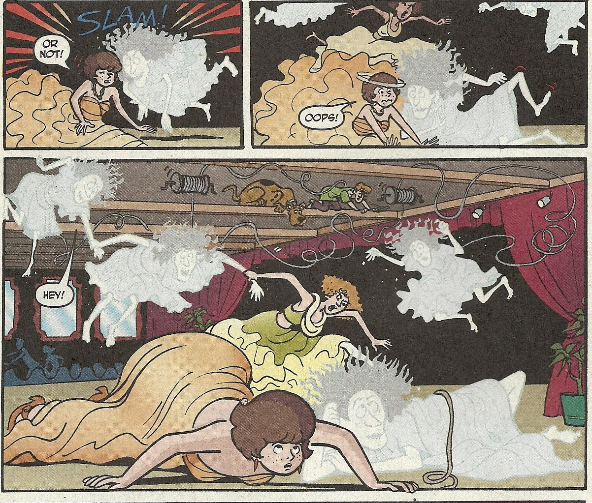
Now that we’ve talked foreground, check out the models in the background. Like Librevou, they belong to a completely different design aesthetic than the Scooby-Doo characters, only they seem even further removed than Librevou. That’s precisely what I find so interesting about Matchette’s drawing of these stories—it’s like the Hanna-Barbera characters just sort of wandered into a comic book, rather than being a comic book created specifically around them. It’s not necessarily a better approach, but it’s an interesting approach, especially considering she’s one of the few artists who went that route on the comics I’ve seen.

Here’s another image of Matchette’s non-Scooby characters, as they take to the catwalk (Meanwhile, Shaggy and Scooby are being chased by the ghosts, and have run up into the rafters)...
When the ghosts descend on the models, the blinded Velma accidentally headbutts one...... bringing them all down in a chain reaction, and the mystery is solved...
Of course! I knew there was something fishy about him when he chose to give Velma a makeover instead of Daphne!

And that's what Karen Matchette's Scooby-Doo comics look like.

Oh, and this issue also includes another “Velma’s Monsters of the World” feature, this one focusing on The Acheri, which artists Roberto Barrios Angelelli and Horacio Ottolini sure made scary…

And another awesome child’s drawing of Scooby-Doo…