The first issue of a new, six-part Black Lightning miniseries came out this week, perhaps the most significant element of it being that it is written by the character's co-creator, Tony Isabella. That is pretty significant given that Isabella and DC Comics haven't been on the best of terms in a very long time, but they seem to have finally gotten on the same page regarding Black Lightning, just ahead of an in-development Black Lightning TV show. That's good; I hope everything worked out to Isabella's satisfaction, and that it continues to be an agreement he's happy with. DC doesn't exactly have the greatest track record in terms of not going out of their way to be dicks to creators who have gifted them with extremely valuable intellectual property decades ago, you know...?
I found a few things about the first issue a little ponderous. First and foremost is, of course, its very existence: I'm not entirely sure what the point of comic book miniseries is anymore in the age of almost instant trade collection. It's one thing if it's a big, status quo-altering event miniseries like Marvel's Secret Empire or DC's Dark Nights: Metal, where fans feel a pressure to read it just to keep up with what's going on, but for a character-specific, quasi-canonical series like this? I have a hard time imagining that Black Lightning has a big enough fan base to make publishing a six-issue, $3.99-a-pop minseries worthwhile (I suppose the idea is to have a trade collection available to sell when the TV show comes out, of course, and maybe DC wanted it to be something newer than Jen Van Meter, Cully Hamner and company's not-so-bad 2014 Black Lightning: Year One (although according to Amazon, it looks like a new volume of that is slated for January, so I guess DC wants multiple, contradictory Black Lightning trades in print, for some reason?). Or perhaps soliciting new Black Lightning work from Isabella was part of their negotiations to patch things up.
The second thing is the weird title: Black Lighting: Cold Dead Hands. I'm not sure why on Earth they would attach a phrase associated with late actor-turned-NRA spokesman Charlton Heston's defense of his right to have whatever the fuck kinds of guns he wanted for whatever reasons, but maybe it will become apparent in future issues. There are some firearms in here, but they are, of course, of the alien tech variety. The police threaten and take shots at BL a few times, and there is some not-so-subtle references to police attitudes towards black men in the issue, but that's about it for gun-related content in the issue.
The third (and rather frustrating) thing is where this fits in with DC's fluid--and growing more fluid?--continuity. I know they already introduced Black Lightning into the post-Flashpoint, rebooted New 52 continuity. That was in the extremely short-lived DC Universe Presents series--you may have already forgotten that existed--in which Marc Andreyko, Robson Rocha, Oclair Albert and others introduced him alongside Blue Devil (Black and Blue--get it?).
He had a cameo or two in the pages of Justice League, too*. I'm not entirely sure if this Black Lightning is meant to be the same one or...what. Like most comics readers, I didn't read a single issue of DC Universe Presents, so I don't know for sure. Isabella has his BL referring in narration to a move he learned from Cyborg, the fact that The Flash told him he kept his costume in his ring (Huh...does New 52 Barry Allen do that...?) and, most weirdly of all, he mentions a character I never heard of, and says that character was defeated by The Red Bee. The Red Bee! A Golden Age character, The Red Bee shouldn't exist at all at present in the DC Universe, should he...?
Regardless, it seems that this version of Black Lightning is at once new, being an unknown element in the new city he's operating in, but also extremely experienced, with a variety of applications for his powers. And he and the book refer to things that have happened before in the past, like another Tobias Whale who isn't the real Tobias Whale.
Anyway, this is yet another example of a worst-of-both-worlds DC comic vis-à-vis continuity, in which the work tries to take advantage of the shared universe and its many characters, concepts and previous stories that originated on the other side of a reboot specifically designed to sever all of that very connective tissue and start fresh. The book it reminded me the most of was the recent Ragman relaunch, another limited series re-introducing a character that was previously introduced into the current continuity, and in such a way to make me wonder which story is meant to be canonical, if they contradict one another so sharply).
Black Lightning is a character I actually have a fair degree of fondness for, although I always found a few aspects of the character problematic. They were exactly the sorts of things that could have--and should have--been fixed in a reboot, but neither has been. At least, not entirely.
One is the costume, which for all its iterations rarely features black-colored lightning bolts on it anywhere. Same goes for this one. There is some black in the costume, and there are some lightning bolt shapes, but those are blue and yellow (The two blue lightning bolts one either side of his chest do frame the black in the middle as a kind of black-colored lightning bolt, or at least a portion of it, extending from his neck to his waist, but it's missing the tip of the lightning bolt shape).
The other is the name of the character. It is cool-sounding name, and works great for a character introduced in 1977, when blaxploitation was a film genre of the only very recent past. But in the 21st century? Especially if we're meant to believe Jefferson Pierce got his electricity powers within the last few years--hell, during the Obama administration:? Why is he calling himself "Black" anything, instead of, I don't know, Lightning Man...?
My solution was to give him black-colored lighting, so he could plausibly use the name, while it would refer to his power, rather than his race. Said lightning could either be literally black, or perhaps a purplish color, like that of the "black" light that emanates from black lights.
Well, no dice. Black Lightning is still shooting electric blue lightning.
So looking at the dude, it really seems like he should be named Blue Lightning. Unless you are going by the color of his skin, which, in 2017, isn't really the way we should be naming our superheroes. I don't know though, this is Isabella's first chance to write his 40-year-old creation in a long time; perhaps he will get to why Black Lightning is called "Black Lightning" in the remaining 100-pages or so of the story.
Despite what likely reads like a lot of complaining and nitpicking, I actually thought this was a surprisingly solid first issue. As a native northeast Ohian who now resides a half-hour from the city, I am obviously excited to see the series is set in Cleveland, where it appears that Jefferson Pierce is going to be the new resident superhero (Isabella, by the way, is a Cleveland native). There are some mentions of Cleveland-specific details, but I don't know that pencil artist Clayton Henry necessarily nailed down the look and feel of the city. That said, I'm curious to read it--well, in trade someday--for the location alone. I mean, it's not going to be as Cleveland a comic book as, say, anything Harvey Pekar ever wrote, but it is and will be fun to see the city filtered through a corporate comics lens.
I thought the costume was pretty decent...Black Lightning has certainly worn worse ones over the years. I think the essential design is okay--even if I prefer black lightning bolts in there somewhere instead of blue ones, and I think the costume that Jefferson Pierce and I designed in the early days of this blog in the previously linked-to post is better--and its only really major flaw is the "functional" look, including seams and padding and armor. (Oh, and the dumb-looking visor, which looks a lot different on the inside of the comic.) This, of course, is the problem with pretty much every post-Flashpoint costume in the DC Universe.
Henry's a strong artist though. While the work is not so dynamic or stylized or original that this is a comic book that one needs to read for the art alone, the storytelling is strong and there's nothing wrong with any of the panels on any of the pages.
Aside from the name-dropping mentioned earlier, and how unmoored this feels in the shared setting, the writing is fine.
All in all, I thought the first issue turned out a lot better than I feared it might.
I would feel weird recommending a book I myself wouldn't buy, but if you like the character and don't mind dropping $3.99 on a single issue knowing it will be collected in a few months time, well, I guess you should buy this.
I have now read the first two issues of Batman: White Knight, Sean Gordon Murphy's Elseworlds-style miniseries in which The Joker breaks good and it seems to be that Batman is gradually being set up as the bad guy.
Murphy is an excellent artist, and it was his artwork more than the concept that attracted me to the pages (I know he's written comics before too, but this is the first of them I've read). He is playing with some very interesting ideas here--in fact, I would say some of them go beyond interesting, and are compelling and, in some cases, relevant.
There's the metatextual criticism that the way in which The Joker has been treated as both a criminal and a person with mental health problems in Batman narratives doesn't make any sense; there's the idea of the wealthy monetizing Gotham City's crime and profiting from Batman's war on it; there's the idea of Batman as an attack dog for the one-percent (a modern-day take on the superhero-as-fascist theme); there's the idea of the police department's tolerance and encouragement of Batman is a form of police brutality and a violation of the justice system.
This week's issue, in which a Batman: The Animated Series-inspired Harley Quinn shows up to defend the cured-and-reformed Joker from a Suicide Squad movie-inspired Harley Quinn was interesting; Murphy's take was the reason the two Harleys are so different is that they are actually entirely different women; The Joker was just too crazy and obsessed with Batman to ever even notice the change.
Something about the series didn't quite feel right to me as I was reading it though, and, at this point, it is more of a feeling than something I am positive I can identify and articulate, but, by the end of the second issue, I think I might have a pretty decent idea of what it is.
In the solicitation text and promotion of the book, it seems like an easy enough, elevator-pitch of an Elseworlds comic: What if...The Joker were the good guy, and Batman were the bad guy? The thing is, that's not quite what it is. Although it might slowly be heading in that direction, it hasn't arrived there yet by the end of the first 40 or so pages. At the start of the book, Batman is quite clearly in his good guy role, and Murphy even provides him with a pretty plausible explanation for acting slightly more unhinged than usual.
I think the thing that bothers me about the book is that it's unfocused in its story. That is, the best Elseworlds stories, and before them, "imaginary stories," can generally be boiled down into something very, very specific. Marvel's most historically prevalent version of this, the "What If...?" stories, actually makes that clear. The story should start from a clearly recognizable point or place, and then diverge in a way simple enough to be described in a single sentence; in the Marvel formulation, a single question.
The most influential and enduring of the alternate takes on Batman is, of course, Batman: The Dark Knight Returns, which basically just extrapolated a possible future for the character after a retirement. (It's not the fact that it's an alternate future for the character that made it what it was, of course, so much as the way the story was told.) After Brian Augustyn, Mike Mignola and P. Craig Russell's "What if Batman was around to fight Jack The Ripper?" comic, 1991's Gotham By Gaslight, DC created their Elseworlds imprint. At that point, alternate takes on Batman came at an almost dizzying pace: What if Batman fought Dracula, and then became a vampire? What if Batman was a cowboy? What if Batman was a pirate? What if Batman was Frankenstein's monster? What if Batman was Green Lantern? What if Superman was Batman? And on and on.
I'm not saying all of these stories were great ones, but the better of them and their ilk were simple in their conception. White Knight, by contrast, doesn't start with a familiar place, and so when it comes to its defining deviation--The Joker going sane and becoming a heroic champion for Gotham City--it feels muddled amid all the other little deviations.
That became most apparent to me while reading this second issue, as its conclusion involves a gathering of Batman's rogue's gallery. Its make-up is essentially that of the villains who appeared in Batman: The Animated Series, something solidified by the presence of Baby-Doll, and even a pair of references to the "Almost Got 'Im" episode (That and the fact that none of the villains who appear didn't also appear on the cartoon show). They are all rather radically redesigned though, and while it's a bravura scene of design work, the fact remains that for all its suggestion of that particular Batman narrative, the series quite clearly isn't "What if The Joker from Batman: The Animated Series became a good guy...?"
Batman works with Nightwing and Batgirl; there is no Robin. There was a Robin, and he was Jason Todd. The Joker kidnapped him at some point and brutally tortured him, but Todd went missing, and no one knows where he is now (So he'll probably put in an appearance before the end of the series).
Mr. Freeze, who is working closely with Batman on a project, is here about two generations older than Bruce Wayne, and became Mr. Freeze sometime in the 1950s or so.
The Joker has a more-or-less definitive sounding origin. His real name is Jack Napier (as it was in the first Batman film), and rather than his appearance being the result of an accident at a chemical factory, it's make-up (as it was in...I don't know; the 1960s TV show, maybe? Or The Dark Knight...?).
That's a lot of little differences, but they add up. I think that is why something feels off about this comic series so far, and I wonder if this might have been an all-around stronger book had the starting point of Murphy's story were more rigorously worked-out at an earlier part of the development process.
Visually, it's a great comic so far. Underneath the pages, though? It leaves something to be desired.
*The Outsiders appeared very briefly during Grant Morrison's Batman, Inc and, more recently, in one of the lead-ins to Metal; I'm afraid in both cases I can't remember if Black Lightning was shown next to the other members of the Outsiders in either instance or not, though.
Showing posts with label sean murphy. Show all posts
Saturday, November 04, 2017
Monday, September 16, 2013
Review: Batman: Black and White #1
Now here's an extremely welcome DC Comics project driven by 1990s nostalgia. While so much of the publisher's time, energy and expense seems to be devoted to capturing the 1990s financial successes of other publishers (hiring Marvel's editor from that time, gimmick covers, Rob Liefeld, etc), this Mark Chiarello-edited project seeks to capture the creative success of particular DC project from the 1990s (It's a strange irony that the output DC Comics in the second decade of the 21t century looks more like what one might expect when they think of comics in the nineties then that of the publisher during the actual nineties).
The idea of the original 1996, miniseries (which spawned a sort of continuation as a back-up feature in the generally excellent Batman: Gotham Knights* series) seemed to be not only to present the publisher's most popular—and most easily adaptable into color-less comics—character in the color scheme of the sub-title, but also to corral as many of the greatest artists possible to do Batman stories, artists who might not even have the time or inclination to do an arc or single issue of Batman: Legends of the Dark Knight, but could probably find the time for an eight-page short story, or, in some cases, just a cover or pin-up.
And so readers got to read Batman comics from the likes of Brian Bolland, Howard Chaykin, Neil Gaiman and Simon Bisley, Teddy Kristiansen, Joe Kubert, Ted McKeever, Kevin Nowlan, Katsuhiro Otomo (!),Bill Sienkiewicz, Walter Simonson, Jan Strnad and Richard Corben, Bruce Timm and Matt Wagner, plus more-or-less regular Batman creators like Chuck Dixon, Denny O'Neil, Brian Stelfreeze and Klaus Janson.
Pin-ups came from the likes of Mike Allred, Moebius (!) and P. Craig Russell, and covers from Jim Lee, Frank Miller (!), Barry Windsor Smith (!!) and Alex Toth (!!!).
Not all of the stories were great, and, in fact, some were rather thunderous disappointments, particularly given the expectations of the creators involved. The short gag comic Gaiman offered was a particular let-down to young, teenage Caleb, I remember; particularly given how good the only other Batman work of his I had read at the time was.
(Fun fact: Gaiman's Riddler story, probably the best "last" Riddler story ever, was penciled by Bernie Mireault, inked by Matt Wagner and colored by Joe Matt!)
So yeah, that seems like a good thing to try again 17 years later, especially with Chiarello (of Wednesday Comics) editing. (As with Bizarro Comics and Bizarro World, the similar Let's Get The World's Greatest Cartoonist To Do Whatever They Want For a Few Pages anthologies, Batman: Black and White is one of those series I wish DC would do if not as an ongoing monthly, then at least as a quarterly or annual).
This first issue bears a cover by Mark Silvestri, who actually had a pin-up in the original volume of the series. Here's one great thing about the format: It really flatters the work of pencilers, particularly ones who either aren't fast enough, interested enough or (and I beg Mr. Silvestri's pardon here) good enough to do great, compelling sequential art. Silvestri's a dynamite image-maker, but not so hot at drawing comics. And hey, with no coloring—especially the effects heavy coloring that predominates today—you can really see and appreciate his linework.
(According to the table of contents, there are two variant covers. One is by Phil Noto, the other is a "DC Collectibles Variant Cover" which I'm curious about, as it sounds like it's a photo of one of those expensive statuettes DC sells...?)
There are five stories in this pricey ($5?! And you didn't even have to pay for color?) but ad-free, 40-page book (There's actually more pages, including ones devoted to creator bios, but only 40 story pages). Let's do 'em one at a time.
"Don't Know Where, Don't Know When"
Written by Chipp Kidd, drawn by Michael Cho
Kidd, who recently wrote the rather excellent original graphic novel Batman: Death By Design, teams with Michael Cho, who has a highly animated, slightly blocky style that will likely evoke the work of Darwyn Cooke in the eyes of many readers, working from what looks like Dick Sprang versions of the character.
There's not a whole lot to Kidd's story, which is more of a collection of events than a statement of any kind, but it does give Cho the opportunity to draw Batman, Robin, The Joker and Superman, and that's more than enough for me.
"Batman Zombie"
By Neal Adams
I'm not really sure why there hasn't been a zombie extrapolation of Batman yet, with DC's Blackest Night being their closest attempt to get on the zombie bandwagon (Although I've heard writer Geoff Johns and others refer to Black Lanterns, zombie-looking superheroes and villains wearing black rings, as something quite distinct from zombies, they're basically just zombies with rings and spandex).
Adams' story is on the preachy and obvious side, but Neal Adams deserves the right to be as preachy and obvious as he wants. The premise is basically that while Batman is good for somethings—fighting Batman's villains for examples—there are many real-world problems like homelessness and the three-strikes laws which he is powerless to stop, which render him, more-or-less, nothing more than "a lifeless burden."
Goddam can Adams draw though, and his zombie Batman is a sight to see (In addition to Batman in his virile, vital form and Zombie Batman, Adams also takes the opportunity to draw The Joker, The Penguin, The Riddler, The Mad Hatter and The Scarecrow.
Adams eschews inks entirely, so his drawings are just straight pencil on paper. It's awesome-looking if, again, there's not a whole lot to it.
"Justice Is Served"
Written by Maris Wicks, drawn by Joe Quinones
I suspect this story will end up being a lot of folks' favorite in this particular installment, as it is basically just an original episode of Batman: The Animated Series condensed into eight pages**. Harley Quinn (and her pet hyenas) and Poison Ivy appear in their Animated Series Designs and with their Animated Series personalities and relationship in place, while Batman plays something of a supporting role. The conflict involves a fast food additive that turns anyone who eats at Gotham Burger into a big, green blob of their former selves, sprouting little leaves (The Joker makes a brief cameo, purely for actual comic relief).
Wicks' interpretation of the cartoon is so right that I imagine whether or not one likes the story will depend on whether or not one liked the cartoon. This really could have appeared in an issue of Batman Adventures, save for Quinones' art being quite a bit more detailed (The designs are the Timm-derived ones, but they are much fuller, richer and more finished than what one normally sees from the "Animated" style).
I don't think this story was necessarily screaming to be in black-and-white though, and Quinones seems to have "colored" it in black and whites, given the many shades of gray and lighting effects worked into it (Like Batman's glowing white eyes, for example).
She's not credited with it, but clearly Wicks drew at least one panel of the story:
I've no idea what the upcoming Harley Quinn comic written by Jimmy Palmiotti and Amanda Conner will be like, but reading this makes me think Quinones would have been a pretty good choice for artist; maybe the editor will keep him in mind for fill-ins.
"Driven"
Written by John Arcudi, drawn by Sean Murphy
Actually, the table of contents puts it as written by Arcudi and "illustrated by" Murphy, but I've been using "drawn by," as "illustrated" has some different connotations. The story itself bears the credits "John Arcudi, Script" and "Sean Murphy, Art and Concept," which is quite a bit different than either.
This story actually also features a Paul Dini-created bat-villainess, the much-less-popular Roxy Rocket. The concept Murpy's come up with is a pretty neat one, providing him the opportunity to draw an extremely dynamic car chase involving Rocket's souped-up rocket car and a fairly massive and intimidating race car version of the Batmobile, that looks equal parts Nolan's Dark Knight and Animated Series, while continuing to cut back to Bruce Wayne's after-action repairs on his car, as he recounts the adventure to Alfred.
It's a gag comic, with a punchline ending, but it's a clever one, demonstrating what an obsessive crazy-person Batman can seem (or, I guess, how "driven" he is). And goodness gracious can Murphy draw. The black and white format offers a pretty incredible look at just how incredible Murphy is, with just his black ink lines on the white paper.
"Head Games"
Written by Howard Mackie, drawn by Chris Samnee
The little biography of Samnee notes that it has been the Daredevil artist's lifelong dream to draw a Batman comic, and this is his first time doing so. That struck me as strange, only because it seems like Samnee's career must be getting awfully close to the "write his own ticket" stage, if it's not there already (I have the feeling their may be some bad blood between DC and Waid for some reason—maybe just because everyone who has stopped writing for them in the last few years usually notes the existence of bad blood—but imagine the current Daredevil team on a Batman miniseries, huh?).
This is a sort of murder-mystery that the reader can't really be expected to solve, but the Bat-villain's appearance comes as sort of a surprise, half-way through. It's a very, very dark take on the character, one that sort of breaks the character, I think, but it's forgivable given the one-off, out-of-continuity nature of the project and hey, given the weird revision this character's gotten in The New 52, it was nice to see some form of this version again.
As one might expect, Samnee's Batman is excellent, his portrayal of the character alternating from a mysterious silhouette with white, triangle eyes to something big and imposing or lithe and athletic, depending on the scene (In the first four panels, I saw a panel that looked Mignola-esque, another that looked Breyfogle-esque, and a touch that could have come from either an old Neal Adams or an old Norm Breyfogle comic).
Interestingly, Harvey Bullock appears in the story, and his depiction is taken almost directly from The Animated Series (although he's exchanged his TV toothpick for his comic book cigar). I don't know how true it holds for Bat-fans in general, but, based on this issue alone, great cartoonists sure seem to love The Animated Series iteration of these characters.
*Not a comic book about a Gotham City sports team
**I was wondering the other day about how odd it seemed that the only cartoon DC continues in comic book form is the shortest-lived, least-influential one, Batman Beyond. But, while wondering, I came to the conclusion that it probably has something to do with how far away that cartoon is from the regular Batman comics. As different in design and aesthetic all 14 or so Batman books are from Batman: The Animated Series, they at least still feature Bruce Wayne as Batman and are set in the present, for example.
**************************
ALSO:
Look for the Batman: Black and White (But Mostly White) Variant cover!
The idea of the original 1996, miniseries (which spawned a sort of continuation as a back-up feature in the generally excellent Batman: Gotham Knights* series) seemed to be not only to present the publisher's most popular—and most easily adaptable into color-less comics—character in the color scheme of the sub-title, but also to corral as many of the greatest artists possible to do Batman stories, artists who might not even have the time or inclination to do an arc or single issue of Batman: Legends of the Dark Knight, but could probably find the time for an eight-page short story, or, in some cases, just a cover or pin-up.
And so readers got to read Batman comics from the likes of Brian Bolland, Howard Chaykin, Neil Gaiman and Simon Bisley, Teddy Kristiansen, Joe Kubert, Ted McKeever, Kevin Nowlan, Katsuhiro Otomo (!),Bill Sienkiewicz, Walter Simonson, Jan Strnad and Richard Corben, Bruce Timm and Matt Wagner, plus more-or-less regular Batman creators like Chuck Dixon, Denny O'Neil, Brian Stelfreeze and Klaus Janson.
Pin-ups came from the likes of Mike Allred, Moebius (!) and P. Craig Russell, and covers from Jim Lee, Frank Miller (!), Barry Windsor Smith (!!) and Alex Toth (!!!).
Not all of the stories were great, and, in fact, some were rather thunderous disappointments, particularly given the expectations of the creators involved. The short gag comic Gaiman offered was a particular let-down to young, teenage Caleb, I remember; particularly given how good the only other Batman work of his I had read at the time was.
(Fun fact: Gaiman's Riddler story, probably the best "last" Riddler story ever, was penciled by Bernie Mireault, inked by Matt Wagner and colored by Joe Matt!)
So yeah, that seems like a good thing to try again 17 years later, especially with Chiarello (of Wednesday Comics) editing. (As with Bizarro Comics and Bizarro World, the similar Let's Get The World's Greatest Cartoonist To Do Whatever They Want For a Few Pages anthologies, Batman: Black and White is one of those series I wish DC would do if not as an ongoing monthly, then at least as a quarterly or annual).
This first issue bears a cover by Mark Silvestri, who actually had a pin-up in the original volume of the series. Here's one great thing about the format: It really flatters the work of pencilers, particularly ones who either aren't fast enough, interested enough or (and I beg Mr. Silvestri's pardon here) good enough to do great, compelling sequential art. Silvestri's a dynamite image-maker, but not so hot at drawing comics. And hey, with no coloring—especially the effects heavy coloring that predominates today—you can really see and appreciate his linework.
(According to the table of contents, there are two variant covers. One is by Phil Noto, the other is a "DC Collectibles Variant Cover" which I'm curious about, as it sounds like it's a photo of one of those expensive statuettes DC sells...?)
There are five stories in this pricey ($5?! And you didn't even have to pay for color?) but ad-free, 40-page book (There's actually more pages, including ones devoted to creator bios, but only 40 story pages). Let's do 'em one at a time.
"Don't Know Where, Don't Know When"
Written by Chipp Kidd, drawn by Michael Cho
Kidd, who recently wrote the rather excellent original graphic novel Batman: Death By Design, teams with Michael Cho, who has a highly animated, slightly blocky style that will likely evoke the work of Darwyn Cooke in the eyes of many readers, working from what looks like Dick Sprang versions of the character.
There's not a whole lot to Kidd's story, which is more of a collection of events than a statement of any kind, but it does give Cho the opportunity to draw Batman, Robin, The Joker and Superman, and that's more than enough for me.
"Batman Zombie"
By Neal Adams
I'm not really sure why there hasn't been a zombie extrapolation of Batman yet, with DC's Blackest Night being their closest attempt to get on the zombie bandwagon (Although I've heard writer Geoff Johns and others refer to Black Lanterns, zombie-looking superheroes and villains wearing black rings, as something quite distinct from zombies, they're basically just zombies with rings and spandex).
Adams' story is on the preachy and obvious side, but Neal Adams deserves the right to be as preachy and obvious as he wants. The premise is basically that while Batman is good for somethings—fighting Batman's villains for examples—there are many real-world problems like homelessness and the three-strikes laws which he is powerless to stop, which render him, more-or-less, nothing more than "a lifeless burden."
Goddam can Adams draw though, and his zombie Batman is a sight to see (In addition to Batman in his virile, vital form and Zombie Batman, Adams also takes the opportunity to draw The Joker, The Penguin, The Riddler, The Mad Hatter and The Scarecrow.
Adams eschews inks entirely, so his drawings are just straight pencil on paper. It's awesome-looking if, again, there's not a whole lot to it.
"Justice Is Served"
Written by Maris Wicks, drawn by Joe Quinones
I suspect this story will end up being a lot of folks' favorite in this particular installment, as it is basically just an original episode of Batman: The Animated Series condensed into eight pages**. Harley Quinn (and her pet hyenas) and Poison Ivy appear in their Animated Series Designs and with their Animated Series personalities and relationship in place, while Batman plays something of a supporting role. The conflict involves a fast food additive that turns anyone who eats at Gotham Burger into a big, green blob of their former selves, sprouting little leaves (The Joker makes a brief cameo, purely for actual comic relief).
Wicks' interpretation of the cartoon is so right that I imagine whether or not one likes the story will depend on whether or not one liked the cartoon. This really could have appeared in an issue of Batman Adventures, save for Quinones' art being quite a bit more detailed (The designs are the Timm-derived ones, but they are much fuller, richer and more finished than what one normally sees from the "Animated" style).
I don't think this story was necessarily screaming to be in black-and-white though, and Quinones seems to have "colored" it in black and whites, given the many shades of gray and lighting effects worked into it (Like Batman's glowing white eyes, for example).
She's not credited with it, but clearly Wicks drew at least one panel of the story:
I've no idea what the upcoming Harley Quinn comic written by Jimmy Palmiotti and Amanda Conner will be like, but reading this makes me think Quinones would have been a pretty good choice for artist; maybe the editor will keep him in mind for fill-ins.
"Driven"
Written by John Arcudi, drawn by Sean Murphy
Actually, the table of contents puts it as written by Arcudi and "illustrated by" Murphy, but I've been using "drawn by," as "illustrated" has some different connotations. The story itself bears the credits "John Arcudi, Script" and "Sean Murphy, Art and Concept," which is quite a bit different than either.
This story actually also features a Paul Dini-created bat-villainess, the much-less-popular Roxy Rocket. The concept Murpy's come up with is a pretty neat one, providing him the opportunity to draw an extremely dynamic car chase involving Rocket's souped-up rocket car and a fairly massive and intimidating race car version of the Batmobile, that looks equal parts Nolan's Dark Knight and Animated Series, while continuing to cut back to Bruce Wayne's after-action repairs on his car, as he recounts the adventure to Alfred.
It's a gag comic, with a punchline ending, but it's a clever one, demonstrating what an obsessive crazy-person Batman can seem (or, I guess, how "driven" he is). And goodness gracious can Murphy draw. The black and white format offers a pretty incredible look at just how incredible Murphy is, with just his black ink lines on the white paper.
"Head Games"
Written by Howard Mackie, drawn by Chris Samnee
The little biography of Samnee notes that it has been the Daredevil artist's lifelong dream to draw a Batman comic, and this is his first time doing so. That struck me as strange, only because it seems like Samnee's career must be getting awfully close to the "write his own ticket" stage, if it's not there already (I have the feeling their may be some bad blood between DC and Waid for some reason—maybe just because everyone who has stopped writing for them in the last few years usually notes the existence of bad blood—but imagine the current Daredevil team on a Batman miniseries, huh?).
This is a sort of murder-mystery that the reader can't really be expected to solve, but the Bat-villain's appearance comes as sort of a surprise, half-way through. It's a very, very dark take on the character, one that sort of breaks the character, I think, but it's forgivable given the one-off, out-of-continuity nature of the project and hey, given the weird revision this character's gotten in The New 52, it was nice to see some form of this version again.
As one might expect, Samnee's Batman is excellent, his portrayal of the character alternating from a mysterious silhouette with white, triangle eyes to something big and imposing or lithe and athletic, depending on the scene (In the first four panels, I saw a panel that looked Mignola-esque, another that looked Breyfogle-esque, and a touch that could have come from either an old Neal Adams or an old Norm Breyfogle comic).
Interestingly, Harvey Bullock appears in the story, and his depiction is taken almost directly from The Animated Series (although he's exchanged his TV toothpick for his comic book cigar). I don't know how true it holds for Bat-fans in general, but, based on this issue alone, great cartoonists sure seem to love The Animated Series iteration of these characters.
*Not a comic book about a Gotham City sports team
**I was wondering the other day about how odd it seemed that the only cartoon DC continues in comic book form is the shortest-lived, least-influential one, Batman Beyond. But, while wondering, I came to the conclusion that it probably has something to do with how far away that cartoon is from the regular Batman comics. As different in design and aesthetic all 14 or so Batman books are from Batman: The Animated Series, they at least still feature Bruce Wayne as Batman and are set in the present, for example.
**************************
ALSO:
Look for the Batman: Black and White (But Mostly White) Variant cover!
Monday, September 05, 2011
Review: Year One: Batman Scarecrow
Despite the couple hundred words I spent talking about how Year One: Batman Scarecrow featured some rather wonky continuity, highlighted and underlined by DC’s decision to collect it alongside a Batman miniseries with completely contradictory continuity, the two-issue miniseries is perhaps most notable for its artwork. It was drawn by Sean Murphy, who would go on to draw the higher-profile 2010 miniseries Joe The Barbarian, Grant Morrison’s only non-superhero work that year. In a way, it’s too bad Murphy collaborated with Morrison on that particular project instead of one Morrison’s many Batman comics, with the latter was writing while the former was drawing Joe. Murphy is an incredible Batman artist.
Murphy’s art, at least as it was in 2005, when this miniseries was published, was a pitch-perfect balance between the “cartoony” Bruce Timm-designed work of Batman: The Animated Series (a style which, outside of Timm’s own comics work, and that of Darwyn Cooke, has hardly ever really seen outside of DC’s own animated-style, detached-from-the-DCU comics),) and a more realistic, more detailed approach.
Murphy’s Batman is a big, hulking superhero, with a bulky build, but free of steroidal muscle bulges and veins—he’s built like an old DC Silver Age character, complete with square jaw, barrel chest and arms like tree branches.
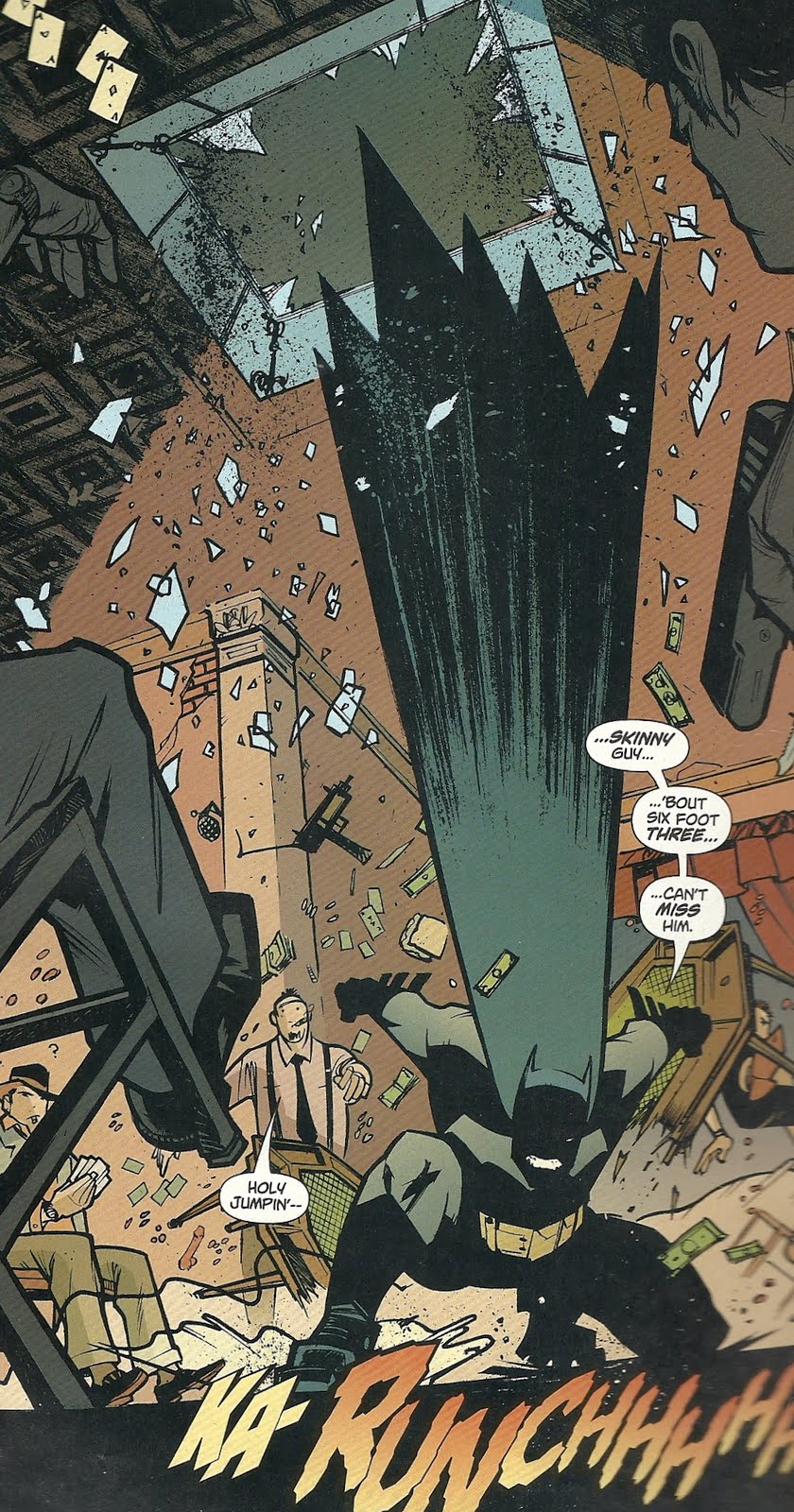
Murphy keeps the character highly abstracted though, particularly in the cape and cowl area. His eyes are white triangle, his mouth a white wall of gritted teeth or a simple line for a frown and, when in action, he gets slightly more abstracted, his cape stretching and pointing to make him look a bit like a black and gray comet.
Look at this image, in which an angry Batman crashes through a skyline and hits the floor of a bad guy hideout, essentially blowing the entire room up.
As I mentioned in the previous post on this series, though this tells the tale of Batman’s first encounter with the villain The Scarecrow, it is now set after Dick Grayson became Robin.Murphy’s Robin is equally inspired and, as Murphy exaggerates Batman’s height and girth and Robin’s size, they clash and compliment one another visually in their size, shapes and lines in the same way that the colors of their costumes clash and compliment (and, in Bruce Jones’ script, the way their personalities and Good Cop/Bad Cop approach to crime-fighting do).
Murphy’s Robin is tiny.
And so’s his cape. While artists went out of their way to design darker, tougher, more realistic and even more badass costumes for future Robins—
—Murphy accentuates the original Robin’s little-kid-who-just-got-out-of-the-circus look.Robin and his costume look completely ridiculous, a little kid playing dress-up, but then, so do Batman and his costume, or The Scarecrow in his costume.
Dressing up in an elaborate costume to fight or commit crime is essentially ridiculous, and Murphy’s art embraces it proudly, rather than half-assing it.
Speaking of The Scarecrow, I’ve devoted a lot of time and space to that character on my blog (as you’ll see if you click on the “Scarecrow” tag and back your way through my archives), so it’s worth taking a moment to look at Murphy’s:
This miniseries was produced to capitalize on any Scarecrow interest associated with 2005’s Batman Begins release (DC produced a Year One: Batman/ Ra’s al Ghul at the same time), but Murphy’s Scarecrow doesn’t take any clues from Cillian Murphy’s banker-with-a-bag-on-his-head look. Beyond the mask and color scheme, and perhaps some tattered edges and the ropes around his armpits, it’s not all that Scarecrow-like (Cover artist Zach Howard gave Scarecrow straw “hair” between his hat and mask, but Murphy doesn’t). There’s a short cape with a jack o’ lantern clasp, fingerless hobo gloves, and a jacket with an awful lot of buckles.
Their Scarecrow spends an awful lot of time outside of his mask too; when menacing his villains, he relies on various chemicals to keep them immobile and or scared, and unmasks to lecture them on his life, Jones’ way of having the character tell the reader much of his origin story. That story keeps the basic sketch of Scarecrow’s origin, that as psychology professor Dr. Jonathan Crane he was kicked out of school for his radical teaching methods on the subject of fear, and so adopted a costume and fear-inducing chemicals to seek revenge on those who wronged him, but Jones goes, much, much further back into his personal history. To his birth, actually.
Jones' Crane was abandoned by both his parents, and left in the care of his great-grandmother. A batty old lady, she moved him into a crumbling, southern mansion where she punished him by a rather elaborate method that involved keeping him in an atrium overnight, to be pecked at by a flock of ravenous crows she’d trained to attack people.
One he’s all grown-up, he journeys to Gotham to revenge himself on one of his old colleagues and then his own father, before going after his mother.
Batman and Robin are, of course, set on trying to stop him. Batman, as is so often the case, sees a lot of himself in villain—they both experienced childhood trauma that lead them to dress up in funny costumes and try to scare people—and is particularly driven to catch him. Robin, meanwhile, tries to convince Batman that they’re very different, and to deflate Batman’s obsession and self-doubt.
As I mentioned previously, the inclusion of Robin in this story seemed like a decision made for the very same reason the original Batman creators added a boy partner in the first place—it gives Batman someone to talk to, and thus moves the story along more briskly and enjoyably.
It’s kind of weird, given how many decades Batman and Bruce Wayne and Robin Dick Grayson were a team, to say this, but seeing them like this was fresh for me, presumably because I didn’t start reading Batman comics until about the time Tim Drake had come along, and DC very rarely published comics set during this particular time-period (The vast majority of Batman stories set in the past, including most of Legends of The Dark Knight, a third Batman monthly that was dedicated precisely to telling stories set in Batman’s past, focus on his pre-Robin days).
As both Batman and Robin and Bruce Wayne and Dick Grayson, Jones portrays their relationship as more of a big brother/little brother, or two friends with very different personalities, relationship, rather than the mentor/student, father/son, obsessed lunatic/voice of reason relationship we usually see.
Their banter is often surprisingly funny, something that Murphy’s artwork really helps sell.
Note, for example, the word “shove” hand-written into the panel above, in which the two take turns trying to break through a bureaucrat’s wall of blasie bureaucracy, each thinking they know the best way to do it.And Murphy sells them in action even better. I highlighted that panel of Batman attacking a room above. Murphy also often tilts a whole room to show falling and movement, as in this panel, wherein a hallucinating Robin turns on Batman, thinking he’s The Scarecrow.
I was also particularly impressed with the way Murphy drew the pair swinging through the air on what used to be called their “bat-lines.”
If you’ve read many, hell any, old Batman comics, you’re probably familiar with the site of Batman and Robin swinging over Gotham City from ropes, the ends of which and what they’re attached to rarely if ever shown (From the ‘90s and forward, when I started reading current Bat-comics, the various Gotham guardians had all adopted grappling hook guns with diamond tipped grapples that hook into stone walls, and are fired with some sort of pneumatic or explosive device imbedded in the handle; in Grant/Breyfogle books, they used to make a little PAF sound effect, and The Animated Series featured a similar little gun device).
Here we never see where the ropes come from, how they’re attached, or what they’re attached to, we just see Batman and Robin, often reduced to silhouettes or abstracted shapes, attached to little lines that pull them off into the distances or out of panel, as if they were attached to speeding, unseen zeppelins or something.Finally, here’s another of my favorite panels of Murphy’s work. The Scarecrow has captured and sprayed his father with his fear gas. His father, it turns out, is phobic about bugs.
When Batman and Robin intervene, and Robin tries to rouse the victim, this is what Murphy gives us:
I’m not sure exactly what it is, the combination of thick and thin lines, I think, but that image of Robin as a giant cockroach really reminds me of a Bill Watterson drawing from a Sunday Calvin and Hobbes strip, one of those where we see inside Calvin’s imagination.Note too how even Scarecrow’s dad gets slightly more abstracted and exaggerated in that panel, the lines of his face and body looking rougher, the shape looser.
(In the next panel, which I didn’t scan, Scarecrow’s dad responds by headbutting Robin, sending the Boy Wonder sprawling across the room with the sound effect “DOOF.”)
So that’s Year One: Batman Scarecrow by Bruce Jones and Sean Murphy. It’s a pretty great Batman comic with really great art, and I’d highly recommend it to anyone who likes Batman comics (although check the back issue bins if you can, as it’s collected with Two-Face: Year One in the trade Batman: Two Face and Scarecrow Year One, and the latter story is no damn good, but I’ll save complaining about that until tomorrow).
Friday, August 12, 2011
Batman will pretty much put a Bat-symbol on anything
Here's a panel from 2005's Year One: Batman Scarecrow #2 (drawn by Sean Murphy and colored by Lee Loughridge), showing a post-workout Bruce Wayne and Dick Grayson, still in their workout clothes.
As you can see, the former has branded his tank top, which no one will ever see him in aside from Dick and Alfred, with a little bat-symbol. Perhaps to designate it as the tank top he wears when doing his Batman workout, rather than one he might wear while simply doing Bruce Wayne workouts...?
Subscribe to:
Posts (Atom)